1. Introduction
The residential housing sector represents the largest asset class in many countries (Spencer 2013). Housing boom-bust cycles are identified as a major source of widespread crisis in the financial system (Quigley 1999). The recent 2007–2009 global financial crisis can trace its origin to the U.S. housing market and the subprime mortgage loans.
In the wake of the global financial crisis, there is an emerging policy debate concerning how to reduce the frequency and severity (magnitude) of these large swings of housing cycles. Policymakers need tools to track the deviation from “intrinsic” values, and to dampen the potential large swings of these housing markets cycles.
One linkage between the housing markets and the financial system is through house purchase financing (mortgage lenders make loans to homeowners against the house as collateral). Thanks to the innovation of financial products, millions of mortgage loans were packaged by Wall Street firms into mortgage-backed securities (MBS). The AIG Financial Products division and the monoline bond insurers played a key role in providing insurance against these mortgage securities.
Market values of the collaterals are subject to considerable volatility. Traditionally, mortgage lenders used the loan-to-value (LTV) ratio as a metric to provide guidelines for origination of individual mortgage loans, where the value in the LTV represents appraisal values, which are predominantly based on comparable sales at the time of mortgage loan origination. Zoeller (2008) discusses issues with the predominant appraisal approaches. Historically, from 1947–1996, the appraisal industry and the mortgage lending industry used multiple valuation methodologies, including the cost approach. Since 1997, as the market comparable sales approach gained preeminence, the cost approach slipped out of favor and is no longer required for mortgages underwritten by Fannie Mae. With the recent housing market boom and bust, the comparable sales appraisal method proved to be pro-cyclical (i.e., cycle amplifying) and created major distortions from long-term intrinsic values. Essentially, the housing appraisals in the U.S. have been following the swings of the market values.
The U.S. housing market values are observed to be too volatile, rendering the LTV unreliable. Figure 1 shows the Case-Shiller index[1] for U.S. national housing market as well as for Las Vegas. For an average house in the U.S., 80% loan-to-value in June 2006 became 112% loan-to-value in June 2010. For an average house in Las Vegas, 80% loan-to-value in June 2006 became 184% loan-to-value in June 2010.
The need for some intrinsic or equilibrium values of houses, other than the market value, is evidenced in the history of the Federal Housing Administration (FHA).[2] Edward Pinto (2014), an economist at the American Enterprise Institute, pointed out that the FHA had developed and implemented in 1938 a definition of value for mortgage lending purposes (called “warranted value”):
The word “value” refers to the price which a purchaser is warranted in paying for a property for continued use or long-term investment. The value to be estimated, therefore, is the probable price which typical buyers are warranted in paying. This valuation is sometimes hypothetical in character, especially under market conditions where abnormalities in price levels indicate the presence of serious quantitative differentials between the two value concepts [warranted value and available market price]. Marked differences between “available market prices” and “values” will be evident under both boom and depression conditions of market. Attention is directed to the fact that speculative elements cannot be considered as enhancing the security of residential loans. On the contrary, such elements enhance the risk of loss to mortgagees who permit them to creep into the valuations of properties upon which they make loans. No other definition is acceptable for mortgage loan purposes inasmuch as one of the objectives of valuation in connection with mortgage lending is to take into account dangerous aberrations of market price levels. The observance of this precept tends to fix or set market prices nearer to value.
Judging by the volatility of historical housing market prices, academics and regulators realized that capital rules relying solely on market values cannot achieve counter-cyclical effects. During times of economic boom, it is politically difficult for policymakers to slam the brakes. Other metrics are needed that are more indicative of the intrinsic value (and thus the long-term market values). At the 2013 “International Conference on Collateral Risk: Moderating Housing Cycles and Their Systemic Impact,”[3] a proposal under discussion among academics and policymakers was to use counter-cyclical loan-to-value, where the value is based on intrinsic values other than market prices. This is also the context and background for this paper.
Actuarial valuation is a time-honored professional practice, which is mostly based on estimates of costs and projections of long-term trends of economic and demographic trends. There is a philosophical debate between market values and actuarial values (see Appendix A). In this paper, we derive actuarial housing values based on a controlled rate of price change that reflects the fundamentals of housing markets and are less volatile than the market prices. The actuarial values can serve as a candidate for the “value” in calculating counter-cyclical loan-to-value at the portfolio level.
In this paper we attempt to apply actuarial methods to develop metrics and tools that can be used by regulators and lenders in monitoring the departures of market values from their long-term sustainable values. The goal of this paper is neither to develop a complete scientific framework nor to produce ready-to-use actuarial housing values. Nevertheless, we hope to achieve a proof of context of applying actuarial methods to housing values, and to inspire more researchers to carry this research further in both the science and the practical calibration.
2. Methodology for deriving actuarial housing values
Our goal is to construct actuarial housing values that reflect the fundamentals and exhibit less volatility than market values. Toward that goal, we employ a control mechanism on the metro level housing price index so that it doesn’t boom too high above or crash too low below the fundamentals. The units in this control mechanism are the adjusted quarterly price change rates. We set a cap and a floor for the quarterly price change rate, and then adjust it with a drift term that incorporates the social and economic effects that affect the supply and demand for housing.
Notations:
Let HPI(t) represent the housing price index at time t. In this paper we use HPI(t) to represent the Case-Shiller indices for 20 metropolitan areas at quarterly frequencies.
The Quarterly Change (“QC”) at time t is defined by:
QC(t)=HPI(t)HPI(t−1)−1
We use a ten-year moving window of housing prices for the past 40 quarters:
→QC(t)={QC(t−j), where j=0,1,…,39}.
We define Cap(t) and Floor(t) by the following formulae:
Cap(t)=E[→QC(t)]+σ[→QC(t)]−drift, Floor (t)=E[→QC(t)]−σ[→QC(t)]−drift,
where the “drift” term is to be calibrated for the specific metropolitan area. The drift term in this paper is backward-looking calibrated. It is fixed from 1999 to 2012. For the future research, the drift term should be time varying, once it is recalibrated and updated over time.
We compute controlled quarterly changes, by imposing the updated Cap and Floor to the Quarterly Change in the Housing Price Index at time t.
^QC(t)=max{Floor(t),min(QC(t),Cap(t))}
We derive actuarial housing values by applying the controlled quarterly changes consecutively:
AHV(t)=AHV(t−1)⋅[1+^QC(t)]
In this paper, AHV is calibrated from January 1999 for each metro area. Since the volatility of housing price was quite low in the 1990s, the selection of the first quarter at that time will not affect the result.
The actuarial housing values are derived from the inclusion of factors specific to the metro area being measured. The key to the actuarial method is the drift term, which is calibrated to reflect the combined effects of economic and demographic factors impacting the supply and demand of housing units in a metropolitan area. In the following sections, we examine some of these factors.
3. Data used in the calibration of actuarial values
Our goal is to analyze housing price data by metropolitan area and price range buckets. Below is a summary of the types and sources of data used for the calibration of the actuarial housing values. Some of the data sources are obtained from third-party data vendors.
4. Factors impacting the supply of housing units
First, we study important factors driving the housing market from the supply side.
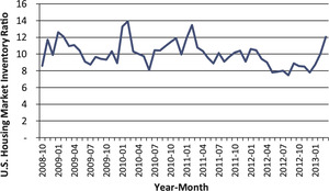
Figure 2 shows that only around 10% of the houses listed monthly in the market are sold and this ratio has remained steady in the past five years. Inventory Supply is the total number on listings at the end of a month divided by the number of homes sold in that month (data source: Zillow).
We make a distinction between two types of housing units available for sale: (i) willing to sell and (ii) forced to sell.
-
Some homeowners have the flexibility of withdrawing from listing if a house is not sold within a reasonable time window (such as 1–2 months). The house owner may choose to re-list again at a later date when the housing market condition changes. We shall categorize this type of house as “willing to sell.”
-
In contrast to the class of “willing to sell,” we observed that some houses would have a price reduction after a period of being listed without finding a buyer at or near the asking price. We shall categorize this type of house as “forced to sell.”
We further divide the “forced to sell” houses into four sub-classes: foreclosure, newly built, migration and death.
4.1. Foreclosure houses
A foreclosed house is one in which the owner is unable or unwilling to make his or her mortgage loan payments and the bank repossesses the house. A bank usually sells a foreclosed home through an auction process.
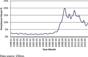
From Figure 3 we can see clearly that before the housing bubble, the foreclosure houses percentage of all U.S. house transactions is around 2%. This ratio jumped to 20% in 2009 and steadily decreased to about 10%, which is still much higher than before the bubble. Since late 2007, the abnormally high foreclosure rate had a material impact on the housing prices, which caused a departure from long-term “equilibrium” housing values.
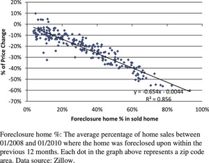
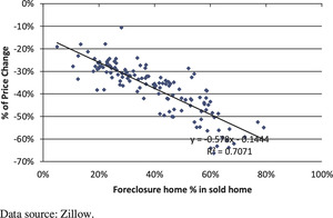
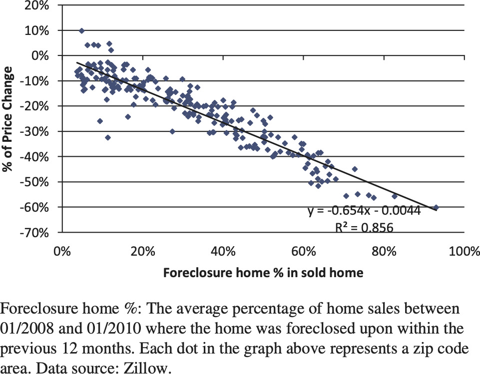
Our analysis reveals that when foreclosure home % increases to a very high level, since late 2008, this jump explains most of the price drops in various zip codes of a metro area. Figures 4 and 5 depict this relationship for Los Angeles and Phoenix, respectively.
4.2. Newly built houses
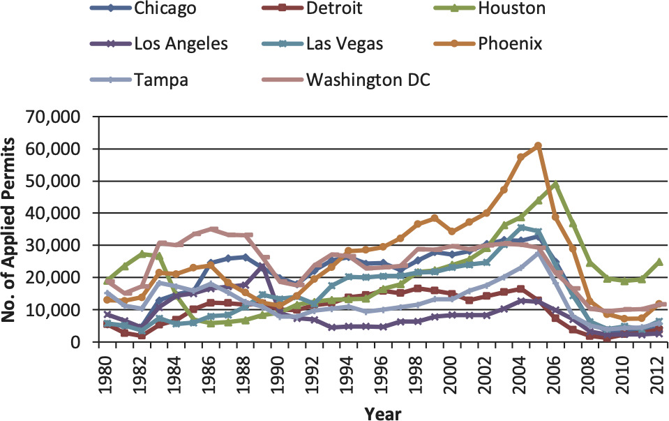
Generally speaking, newly built houses are under more pressure to sell in a short time than owner-occupied homes. Builders of new homes normally have liquidity constraints and incur carry-costs of serving their bank loans. However, data for newly built houses are not readily available. In this paper, we use the number of building permit applications as a proxy indicator of newly built homes.[4]
4.2.1. 2002–2006: A glut of newly built houses
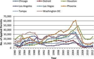
From Figure 6 we observe that during the time period of 2002–2006, there was a spike in building permit applications. The house permits applications in Phoenix during that time period were more than double that of the time period 1997–2001. Assuming there is a 2- to 4-year lag between building permit applications and newly built houses, it is reasonable to expect excess supply of new houses between 2007 and 2010.
4.2.2. 2008–2012: Scarcity of newly built houses
It can be said that the strong housing market recovery in 2012 and 2013 is partially due to the reduced inventory of houses. Other factors didn’t change significantly from 2011 to 2012, such as mortgage rates, foreclosure rates and the household income distribution.[5]
The cumulative effect of fewer newly built houses from 2008 to 2012 eventually led to a low inventory of housing supply, coupled with years of delayed house purchases by newly formed families, resulted in a shift of the balance in the housing supply-demand equation.
Figure 7 is a plot of Phoenix’s one-year house price percentage change and the housing inventory ratio.[6] A significantly negative relationship is observed between these two ratios.
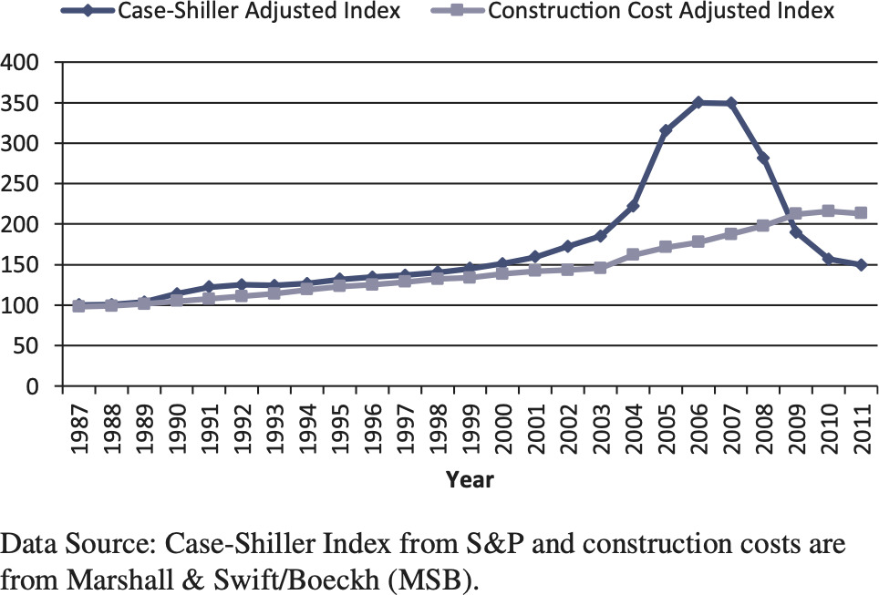
Figure 8 shows the relationship between housing prices and construction costs for Las Vegas.
We find that the number of building permit applications is inversely correlated to the ratio of housing market price to construction cost. The housing price index dropped below the construction cost index after the housing bubble burst, which led to the recently low supply of newly built houses.
4.3. Net migration
Table 1 shows population and migration change from 2000 to 2008 for six cities. The effects of demographic trends on the housing prices are well documented in academic literature (Belsky 2009; Myers, Pitkin, and Park 2002).
In most cases, when people move to another city, they need to sell their original house quickly so that they can get cash for relocation and eliminate the carry cost of the empty house.
Detroit is the prime example of outflow migration. From 2000 to 2008, among our eight targeted metropolitan areas, Detroit is the only one which experienced a population decrease, and most of this decrease is due to the highly negative net migration. With its highly negative net migration, Detroit is also the only metropolitan area which had a nominal house price drop compared to 1998 among our eight targeted metro areas.
While the outflow migration has a significant impact on housing supply, the inflow migration also has a material effect on housing demand. However, the effect of net inflow is trickier than outflow since different metro areas have very different population densities. For example, the population densities of Las Vegas and Phoenix are much lower than other metro areas; each is only approximately one-fourth of Chicago, Washington, Detroit, Tampa, and one-tenth of Los Angeles. Therefore, even though Las Vegas and Phoenix had a net population increase of over 30% during 2000 to 2008, we did not observe that strong of an increase in their local housing markets.
4.4. Death
Age distribution also has an effect on housing supply. Tampa has a significantly higher percentage of older people, which leads to a higher rate of death. Table 2 shows the population and death statistics for eight metropolitan areas.
In Tampa, the houses for sale from death are roughly equal to the number of newly built houses. Table 3 shows the number of single family build-ing permit applications in Tampa from 1996 to 2000.
If we simply assume two deaths will empty one house, the number of houses for sale due to death in Tampa for year 2000 is 14,288. The five-year average number of applications for single family building permits is only 11,785.[7]
Overall, death is an important factor to compare different metro areas’ dynamics. It is quite stable for one metro area through time unless that metro area has a significant trend in demographic distribution.
To sum up this section, the supply of the housing market in the U.S. is composed of two different groups: willing to sell and forced to sell. Historically, the number of willing to sell houses is much higher than that of forced to sell houses. The forced to sell houses are composed of foreclosure houses, newly built houses, migration outflow houses, and houses emptied by death. The last two factors are more fundamental and change relatively slowly from year to year. However, those two factors which determine the long-term trend of the housing market are quite different from region to region, such as Detroit (high migration outflow) and Tampa (high death rate). The former two factors are more affected by market conditions and could fluctuate rapidly in a relatively short period. For example, the number of foreclosure houses increased dramatically after the housing bubble, an effect that dominated the housing price changes between 2008 and 2010. The recent housing market boom is in part due to the low inventory supply, which is because of the extremely low volume of newly built houses since 2008.
5. Factors impacting the demand for housing units
The following factors determine the housing market demand curve.
5.1. Household income distribution
Traditionally, housing economists use the ratio of median house price to median household income as the indicator for measuring housing affordability in their research. Our research indicates that such a ratio may not be the best indicator. Using a mortgage payment model, we have found that a higher percentile (e.g., 65%) of the income distribution is a better metric than the median (50%) to match with transacted house prices.
In our mortgage payment model, we assume that the buyer pays a 20% down payment and takes a 30-year mortgage for the remaining value of the house. We compare data for each zip code–level historical median traded house price with household income distribution within the same zip code. By using the historical mortgage rates, we match the median traded house price to a percentile of the household income distribution. By doing this calculation for all zip codes within one metro area, a house price matching income percentile distribution can be formed.
Figure 9 shows Chicago’s implied income percentile distribution.
We calculated this income percentile distribution for all eight metro areas and only Detroit has an implied income percentile distribution with a median lower than 0.5. Some metro areas’ distribution medians are even higher than 0.7 or 0.8.
A possible explanation for this result is that people usually buy their houses between age 30 and 50, which is at the peak of their lifetime income curve. Therefore, if we compare their income to the total income distribution, the implied income percentile is usually higher than 0.5.
5.2. The effect of mortgage rates on affordable prices
Changes in the mortgage rates have a parallel shift effect on demand curve of household income.
Based on the monthly cash flow formula, the affordable house price would be
Price =12Mi⋅[1−1(1+i12)12N]
where:
-
i is the annual mortgage rate,
-
M is the monthly payment,
-
N is the number of years of the mortgage.
Table 4 shows how the amount of affordable price is impacted by changes in the (30-year fixed) mortgage rate assuming M = 1000.
From Table 4, we can observe that the mortgage rate has a significant effect on the affordable price. An increase in the mortgage rate from 3.0% to 4.0% results in an almost 12% decrease (from 237,000 to 209,000) in the affordable price.
A caveat of this analysis is that the homeowners incur other associated costs of homeownership, including property taxes, utilities, maintenance and home-owner’s insurance.
5.3. Age distribution
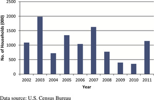
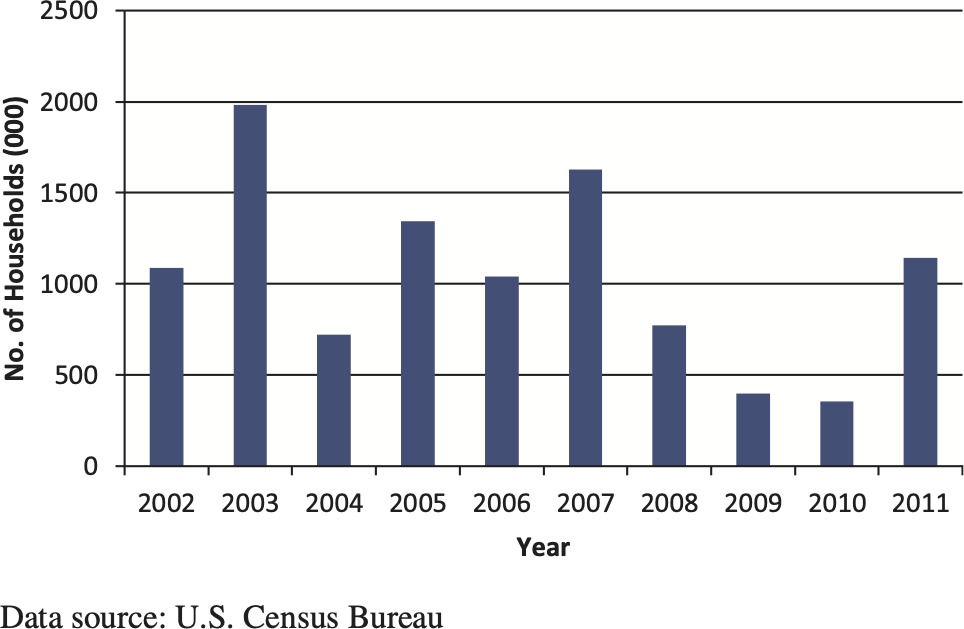
After the financial crisis, a shortfall in household formation is observed during 2008 to 2010. Figure 10 shows ten years of available U.S. household formation data from 2002 to 2011.
The temporary delay in household formation is partially due to a so-called “doubling up,” where recent college graduates stay in their parents’ houses waiting for a more stable job before buying their own first homes. When the housing markets recover, we expect that those who were waiting may come into the housing markets, which may increase the demand for housing. Since young adults are more likely to be the source of the household formation, it is necessary to account for the age distributions in different metropolitan areas, especially for age group 18 to 35.
Some research papers have already proven that different age groups have varying effects on the housing market. Lindh and Malmberg (2008) find that large populations of young adults are associated with higher rates of residential construction in Sweden. The effect of the age group 15–29 on housing demand is more than twice of that of age group 30–49 and around five times that of age group 50–64.
5.4. International sales
It is observed that more and more international buyers are entering the U.S. housing market, especially concentrated in three states: Florida, California, and Texas. Cities like Miami, Los Angeles, San Francisco, Dallas, and Houston experienced a significant international migration in the past decade. This continuing trend in net international migration resulted in a long-term boom in the local housing markets.
For example, Los Angeles experienced a continuous and significant international migration inflow since 2000. This extra international capital drove the local housing prices to an unreasonably high level. Figure 11 shows the housing price implied income percentiles before and after the housing bubble.
6. Housing market dynamics
Traditional housing market analysis usually relies on regression techniques, which we consider to be inappropriate for housing markets. As we summarized at the end of the housing supply section of this paper, the housing market is a dynamic market, for which static analysis cannot capture the variation in price, especially in a volatile market.
Figure 12 is the graph of relationship between housing price change and foreclosure rate in the Los Angeles metro area. We can see that the foreclosure rate is a highly significant factor in explaining the housing price change between 2008 and 2010. However, this strong relationship disappeared in 2011.
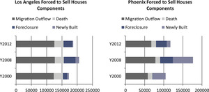
For a given housing market, one factor could dominate the influence on housing price change during a specific time period. However, when market dynamics change, this dominating influence rapidly weakens or even disappears. Figure 13 shows the different dynamics of the housing market supply of Los Angeles and Phoenix before, right after, and further after the housing bubble. As we can see, different factors in the metropolitan areas in different years have varying weights. Basically, demographic and economic conditions determine the fundamentals of a local housing market. Temporary high foreclosure rates and low inventory of newly built houses can be called market responses to unfair housing price levels and revert the price level back to its mean. Calibration of the drift term in the actuarial formulae requires an analysis of the dynamics of a given housing market.
Researchers of real estate markets often resort to inferential analysis of housing markets (see Black, Fraser, and Hoesli 2006; Edelstein and Tsang 2007; Wheaton and Nechayev 2008). They use analysis of house price to household income, house price to rents, vacancies, absorption/time on the market, prices, and construction starts to estimate normal vacancy rates and time on the market inventory. We considered these relative factors in understanding the dynamics of the housing markets.
Instead of the regression method, we propose the actuarial valuation presented at the beginning of this paper. Actuarial value is a housing price benchmark based on a controlled rate of price change, which is calibrated based on the dynamics of the metro specific housing markets.
In the next section we present the results of the actuarial housing value.
7. Results of actuarial housing values
Our calibrations of the actuarial housing values for each metropolitan area are done through a metro-specific drift term. At the heart of the methodology for actuarial housing value is a two-step calibration process of the metro-specific drift term.
Step 1. Estimation of an initial drift-term by minimizing mean squared errors (MSE).
The drift term in this paper is backward-looking calibrated. It is fixed from 1999 to 2012. We estimate an initial drift term by minimizing the mean-squared error. This step is purely backward-looking since it is just the mechanical exercise of minimizing mean squared error.
We assign the starting point of the data series to be January 1999. It is noted that the volatility of housing price was quite low in 1990s, so the controlled quarterly changes, are the same as the uncontrolled quarterly changes, QC(t), for the early 1990s.
For instance, for Washington, DC, the average QC(t) in 1998 is only 0.9% while the average cap is about 1.6% and the average floor is −0.9%.
Step 2. Validation and adjustment of the drift term.
The second step involves validating the estimated drift term based on the housing markets dynamics and making adjustments based on a forward-looking assessment of the fundamentals. The validation and adjustments involves many economic variables, including comparisons of construction costs with market values. In making forward-looking adjustments to the drift term, there is no unique scientific formula and actuarial judgment is required, due to the complex and ever-evolving housing market dynamics.
For instance, for Detroit, the calibrated drift term is 0.012, which is significantly higher than other metro areas’ drift terms (remember, a higher drift term means a lower cap and lower floor). As discussed in the previous sections, Detroit is the only metro area in our study that experienced a negative population change from 2000 to 2008, and it also has had the second highest unemployment rate since 1999.
Meanwhile, Las Vegas has the lowest calibrated drift term, which is −0.005. Las Vegas experienced the greatest population increase from 2000 to 2008 among the metro areas we studied and it also has had the second lowest unemployment rate since 1999. Below are some of the calibrated drift terms.
In summary, while the actuarial housing values are functions of many variables, including migration, demographic distribution, population density, construction cost, income distribution, etc., the metro-specific drift is calibrated by minimizing the sum of squared errors between the Case-Shiller index and the actuarial housing value over the most recent ten-year moving window. The calibrated drift term is further verified to be correlated with the fundamental factors of a metro area, such as unemployment rate, migration, etc.
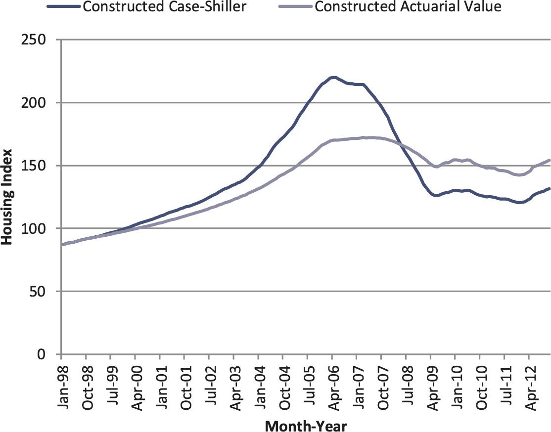
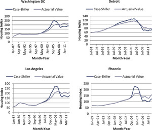
We apply the actuarial approach to housing price data at the metropolitan level. Figure 14 presents the results for Washington, DC; Detroit; Los Angeles; and Phoenix.
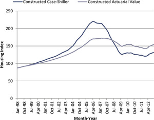
We calculated the actuarial value for the following metro areas: Chicago, Detroit, Houston, Las Vegas, Los Angeles, Phoenix, Tampa, and Washington, DC. By using the annual trade volume as the weights, we derived the U.S. nationwide housing index. In Figure 15 we compare the reconstructed (or weighted) Case-Shiller index with the actuarial value for the U.S. national housing market.
8. Potential applications of the actuarial housing value
Actuarial housing values can help actuaries to offer valuable professional services to the appraisal industry and the lenders. Knowing the relative relationship of actuarial housing values and market values can help regulators to effectively measure and manage systemic risks for the housing market, and the impacts of these risks on other sectors of the economy. Indeed, if the differences between the actuarial housing values and market values had been used as an input to the Gaussian copula model (Li 2000; Salmon 2009) for credit default swaps, the correlation among mortgage-backed securities would have been much higher. Actuarial housing values can enable lenders to monitor the aggregate departures of actuarial values and market values, similar to the way that insurers track their aggregate catastrophe risk exposures. Actuarial housing values can also help actuaries to perform pricing and reserving functions for mortgage insurance. The actuarial housing value can even serve as a basis for designing reverse-mortgage products. The proposed actuarial values are most applicable to those who have to mark-to-market their HPI-related assets. Using this muted HPI protects them from wild swings.
9. Areas of future research
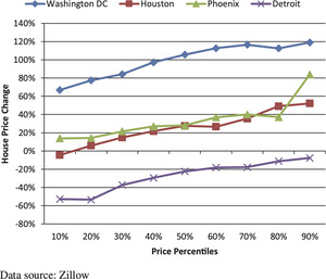
As one promising area of future research, we can derive a distribution of actuarial housing values by housing price buckets. Figure 16 shows the house price changes from 12/1999 to 12/2012 for different price percentiles of several metro areas. From Figure 16 we observe higher price changes from 1999 to 2012 for houses at higher price ranks of each metro area. The different performances across different housing price buckets can further demonstrate the power of an actuarial approach.
As another area of future research, we plan to adapt the actuarial valuation method presented in this paper to China’s housing markets, incorporating the special characteristics of China’s housing markets (as discussed in Appendix B).



.png)






.png)


