


1. Introduction
U.S. insurers are required by regulators to file annual financial statements. We have compiled and cleaned a historical database of these filings, which presents opportunities for a vast scope of analysis. Our analysis of this database has produced pricing and reserving risk benchmarks and an underwriting cycle model, which are presented in this paper and can be used by insurers in their own enterprise risk management (ERM) modeling.
Our data sources are from SNL Financial, the National Association of Insurance Commissioners (NAIC), and A.M. Best. Specifically, at the industry level, we compiled the data from Best’s Aggregates and Averages (1976–2010). At the individual firm (in this paper, a firm refers to a company group, which may consist of many individual operating companies) and line of business level, we have compiled and cleaned the data for
-
Gross (direct and assumed) and net paid, case incurred, and IBNR loss triangles reported[1] as of 1996 to 2009, for accident years 1987 to 2009.
-
Gross and net premium triangles reported as of 1996 to 2009, for accident years 1987 to 2009.
In this paper, we have
-
Analyzed the historical underwriting cycle and modeled the future underwriting cycle (section 2).
-
Analyzed the volatility of ultimate loss ratios by line of business and firm type (section 3.2).
-
Studied the volatility of changes to reserves estimates, by analyzing how the ultimate loss changes from its estimation at 12 months of development from the year of accident to 120 months development (section 3.3).
-
Estimated the correlation between lines of business of the ultimate loss ratio and reserve development (section 3.4).
This paper differs from previous work in that:
-
The underwriting cycle model in this paper, being a nonlinear regime-switching model, is fundamentally different from models developed in previous research papers, which are generally linear autoregressive models.
-
The data used in this paper is at the individual firm (company group) level, which is a fine level of granularity. While some previous research papers address firm-level behavior, typically only simple edits are used to eliminate suspect data. By contrast, we have made extensive efforts to identify and correct erroneous data.
The findings presented in this paper are an example of the possible analysis that can be done, now that we have compiled this database. For example, an evaluation of pricing and reserving risk benchmarks can be made for a more targeted group of companies, to provide more relevant benchmarks for any one insurer.
2. The underwriting cycle
2.1. History of the underwriting cycle
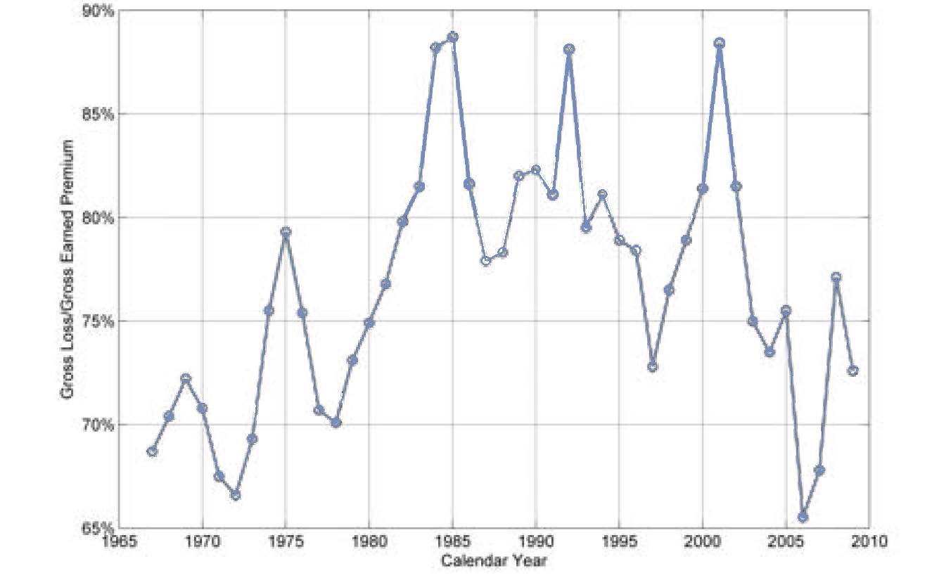
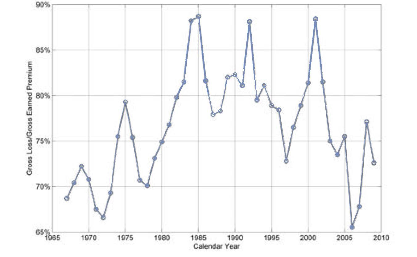
Over the past few decades, the U.S. property and casualty insurance industry has experienced periodic changes in profitability known as the underwriting cycle. As can be seen in Figure 1, the all-lines ratio of calendar-year gross losses[2] to premiums appears as a wavy pattern, with values ranging from 65% to almost 90%.
2.2. Capacity constraint theory
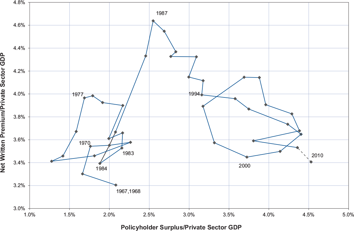
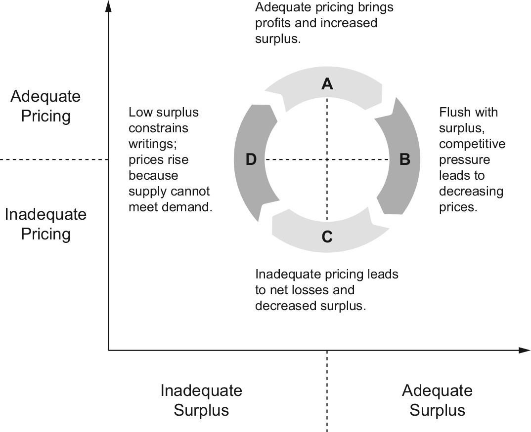
There are many theories about the causes and mechanics of the cycle. One of the more popular is the “capacity constraint” theory. This focuses on the dynamic relationship between pricing and surplus. The capacity constraint theory is illustrated by Figure 2, which distinguishes between inadequate and adequate levels of surplus (horizontal axis) and inadequate and adequate pricing (vertical axis).
Time lags in reporting and in the emergence of losses interfere with the ability of firms to anticipate changes or make quick adjustments. The result is the cycle.
Figure 3 shows the historical pricing versus surplus cycles. Total premium share (TPS) is our proxy for pricing. It is the ratio of net written premium to private sector GDP (PSGDP), which we use as an exposure measure. The ratio of policyholder surplus to private sector GDP is used as our surplus measure.

Figure 3 shows two underwriting cycles that conform to the circular pattern predicted by the capacity constraint theory: one from 1970 to 1983, and another from 1994 to 2008. The two underwriting cycles are separated by a period of extraordinary losses and a surge in premiums from 1986 to 1992 known as the “liability crisis.” The 2010 figures are projected from partial-year data.
We can view TPS as the key driver of the underwriting cycle. The TPS can be viewed as a proxy for a pricing index, as, all else being equal (market penetration, terms and conditions, etc.), an increase in the TPS should be matched by a corresponding decrease in the loss ratio. Of course, all else is not equal. Other factors mediate between the all-industry all-lines TPS and the LOB-specific underwriting experience of a particular firm; this will be the subject of a future paper.
2.3. The role of the underwriting cycle in enterprise risk management
Currently, the underwriting cycle is not an explicit feature of most insurers’ enterprise risk management models. Distributions used show no autocorrelation—an upward movement in loss ratios or reserve estimates in one year has no bearing on whether there is an upward movement in the following year.
However, the existence of the underwriting cycle is undeniable. Figure 1 shows that in real life, a series of deteriorating years is reasonably likely, and, for many insurers, this is the scenario of greatest concern. Conversely, a series of deteriorating years is highly unlikely in a model with no underwriting cycle—this model will, perhaps materially, underestimate risk.
To remedy this, we propose a model of the underwriting cycle which produces simulated outcomes that can be fed into an insurer’s enterprise risk management model.
2.4. Literature review on underwriting cycle models
There are many research papers devoted to theories and models of the underwriting cycle. Built upon previous work of Major (2007), we classify some papers into the following themes.
Institutional factors: Pricing involves forecasting based on historical results, resulting in the price estimate lagging the true loss cost and creating the underwriting cycle. Papers exemplifying this explanation include Venezian (1985), Cummins and Outreville (1987), Lamm-Tennant and Weiss (1997), and Chen, Wong, and Lee (1999). Venezian’s paper is noteworthy as an early explanation, often referred to as the “actuaries are dumb” theory because it assumes naïve regression-style extrapolation in rate-making. Cummins and Outreville (1987), however, show that reporting and regulatory delays could cause the second-order auto-regressive pattern Venezian observed, even under the assumption that actuaries behave as rationally as possible. Recently, Clark (2010) demonstrated that in the presence of estimation errors, applying theoretically correct actuarial techniques naturally leads to cyclical behaviors. Winter (1991) shows that a regulatory premium/surplus constraint can lead to “catastrophe dynamics” and cycles.
Competition: Not all competitors have the same view of the future, with a “winner’s curse” (Thaler 1992) phenomenon pushing the group towards lower rates, even if all participants are behaving rationally (and they may not be). Examples of this reasoning include Feldblum (1990), Harrington and Danzon (1994), Harrington (2004), Fitzpatrick (2004), Baker (2005), and Alkemper and Mango (2005). Feldblum provides a detailed explanation of competitive mechanisms and firms alternating between underwriting strategies of aggressive growth and price maintenance.
Supply and demand, capacity constraints, and shocks: Since insurance needs capital to support it, any shock that reduces capital, such as a natural catastrophe, will reduce capacity and therefore raise prices as supply becomes constricted. Declining profits may be exacerbated by anti-selection as more favorable business exits first. Capital market frictions (costly external capital) mean that capital cannot be replaced quickly (another source of delay). Papers include Winter (1994), Gron (1990, 1994), Niehaus and Terry (1993), and Cummins and Danzon (1997). Higgins and Thistle (2000) and Derien (2008) develop regime-switching models (regimes are AR models) to detect capacity constraint.
Economic linkages: Profitability for an insurer is linked to investment income, and cost of capital is linked to the wider economy. Expected losses in some lines of business are affected by inflation, GNP growth, or unemployment. Therefore, cycles in the economy result in cycles in insurance. Examples include Wilson (1981), Doherty and Kang (1988), Haley (1993), Grace and Hotchkiss (1995), and Madsen, Haastrup, and Pedersen (2005).
All of the above: Schnieper (2005) constructs a model which incorporates all above types of theories. Fung et al. (1998) test the predominant theories for underwriting cycles by sophisticated statistical methods and find that no single theory can explain underwriting cycles completely.
The model presented in this paper, while motivated by the above theories, is not focused on testing any particular theory. It is aimed at capturing the asymmetrical features of the downward versus upward cycle paths.
2.5. Modeling the underwriting cycle
2.5.1. Required properties of the underwriting cycle model
Our simulation model for the underwriting cycle starts with the capacity constraint theory insight into pricing behavior. It is strictly empirical, driven by the data, but its structure is informed by the mechanics of the insurance industry.
The key to the state of the cycle is the TPS, the ratio of net written premiums to private sector GDP. A time series of TPS is shown in Figure 4 . We define two phases or regimes:
-
Softening (DOWN regime): a year in which the TPS is lower than in the previous year
-
Hardening (UP regime): a year in which the TPS is higher than in the previous year
.png)
We list below four requirements for the behavior of the underwriting cycle model:
Some degree of auto-correlation
We observe from Figure 4 that:
-
A softening (DOWN) year generally tends to be followed by another softening year.
-
A hardening (UP) year tends to be followed by another hardening year.
Therefore, we require some degree of autocorrelation of the TPS from one calendar year to the next.
Switching of phases is a function of the TPS
We observe from Figure 4 that:
-
A softening year is more likely to be followed by hardening when TPS is low.
-
A hardening year is more likely to be followed by softening when the TPS is high.
Therefore, we require the phase—i.e., the direction of change of TPS—to be a function of TPS.
Statistical behavior is different in the two phases
We observe that:
-
It takes more years for prices to go down than to go up. Normally, it only takes 2–3 years for prices to go up, but the period is much longer for a downward move.
-
A positive difference (indicating prices going up) tends to be larger than a negative difference.
-
The volatilities are different in the hardening versus softening phases.
The first two observations above can be easily confirmed by the following stem plot (Figure 5) for the first difference of log(NWP/PSGDP)[3] data:
.png)
The third observation, that volatilities are different in hardening versus softening phases can be validated by a statistical test, but before doing that, we introduce more formal notation. For any given year t:
-
Yt = log(Total Premium Share) = log(NWP/PSGDP);
-
Yt − Yt−1 is called a backward difference.
-
Yt+1 − Yt is called a forward difference.
The sign of the backward difference establishes the regime for the forward difference. That is:
-
If at time t, Yt − Yt−1 ≥ 0, i.e., the backward difference was positive (or zero), we say that Yt is now in an UP regime.
-
Similarly, if Yt − Yt−1 < 0, i.e., the backward difference was negative, we say that Yt is in a DOWN regime.
Scatter plots of the forward differences for those two regimes are shown in Figure 6. That is, the forward difference in those instances where the backward difference was positive is plotted in the UP regime graph, and the forward difference in those instances where the backward difference was negative or zero is plotted in the DOWN regime graph:

It can be seen that the forward difference in an UP regime (i.e., when the backward difference was positive or zero) is also likely to be positive or zero. However, we have some possibility of a downward move (i.e., switching to a DOWN regime). Similarly, the forward difference in a DOWN regime is also likely to be negative, but there is still some possibility of an upward move (i.e., switching to an UP regime).
After defining the two regimes, we determined whether those two groups of forward differences have different variance. A two-sample F-test for equal variances was performed. At a 7% significant level, the UP regime has a significantly larger variance than the DOWN regime, confirming our observation.
However, if we remove an apparent outlier in the DOWN regime (the triangle in the upper left of Figure 6’s DOWN chart, representing the 1984–85 transition, the start of the liability crisis hardening), we then see a highly significant (0.1% level) variance difference between these two groups.
Because of these statistical properties, we believe that separate treatment of UP and DOWN regimes is necessary. This rules out the use of a simple autoregressive (AR) model.
It should explain itself; no exogenous variables should be included.
If this requirement is violated, meaning we include exogenous variables, then we have to make efforts to simulate those exogenous variables. We believe that private sector GDP is an appropriate proxy for exposure at the industry level. This is an exogenous variable and is available from government sources for calculating historical values of TPS. Note, however, that it is not needed to simulate future values.
2.5.2. Proposed model: Regime-switching model
Model structure. We propose the following model structure that satisfies all four requirements listed above. Future TPS is simulated using a regime-switching Markov model based on its historical values and the current regime. Specifically, given a starting point Y0, and a starting regime, we can simulate future Yt using:
-
If Yt − Yt−1 ≥ 0, i.e., Yt is in an UP regime, the forward difference is given by:
Yt+1−Yt=fUP(Yt)+εUP,t
-
If Yt − Yt−1 < 0, i.e., Yt is in a DOWN regime, the forward difference is given by:
Yt+1−Yt=fDOWN (Yt)+εDoWN, ,t
It remains to find suitable functions fUP and fDOWN, and distributions for the residual terms εUP and εDOWN.
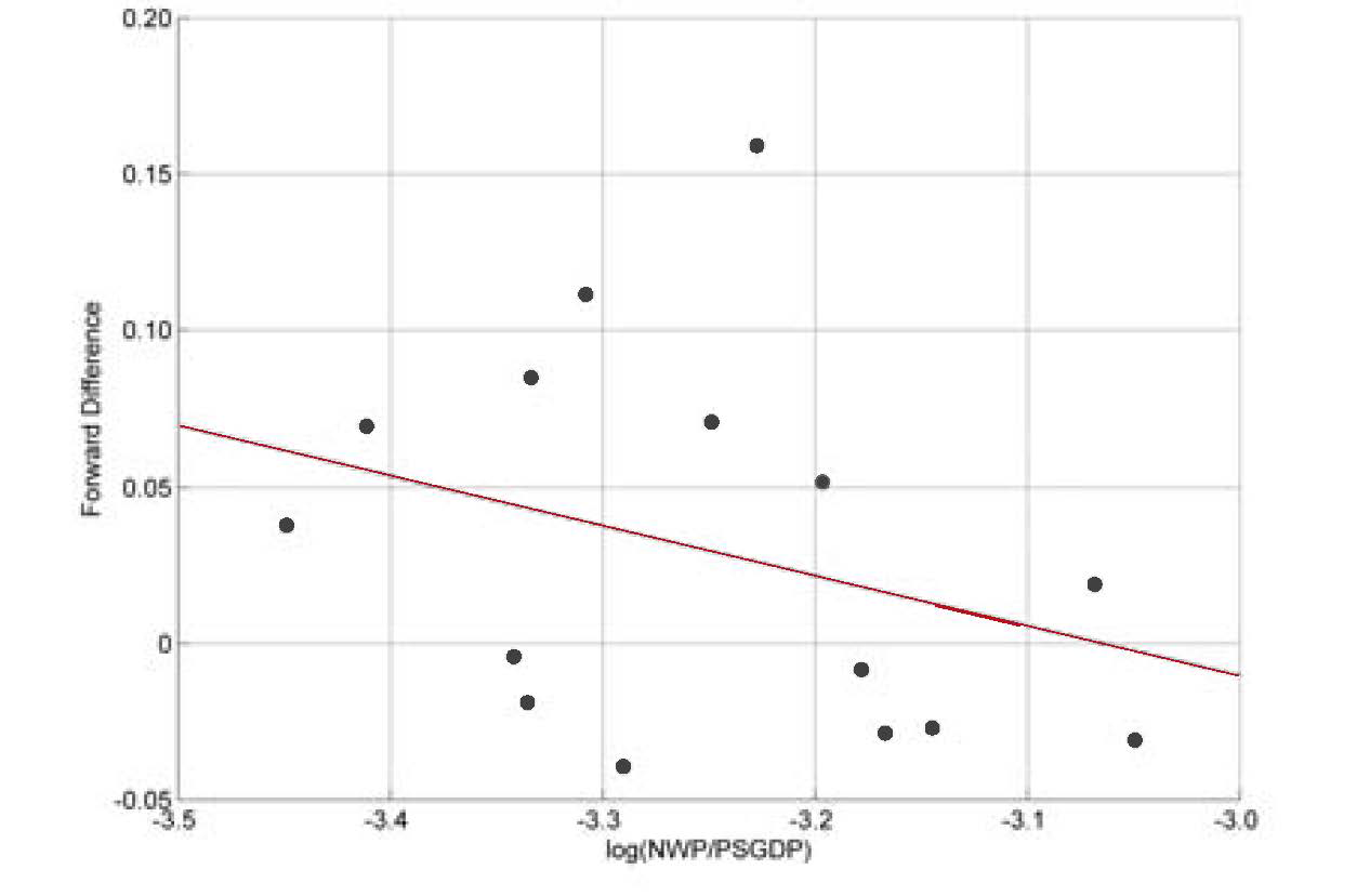
Fitting the model. For the UP regime, the data appears to have a linear pattern, so a linear regression for fUP was undertaken (Figure 7).

The linear equation takes the following form:
Yt+1−Yt=−0.4891−0.1597⋅Yt+εUP,t
The variance of residual terms is 0.0032. Due to the small sample size, the histogram (not shown) of residuals εt does not show a bell-curve shape. However, a Lilliefors test indicates that we could not reject the null hypothesis that the residuals are normally distributed.[4] A chi-square goodness-of-fit test gave us the same result: we could not reject the null hypothesis. For both tests, the significance level is set at 5%. Therefore, we will assume that εUP,t ≈ N(0,0.0032).
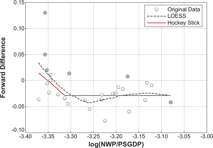
For the DOWN regime, we identify a nonlinear pattern (see Figure 8).
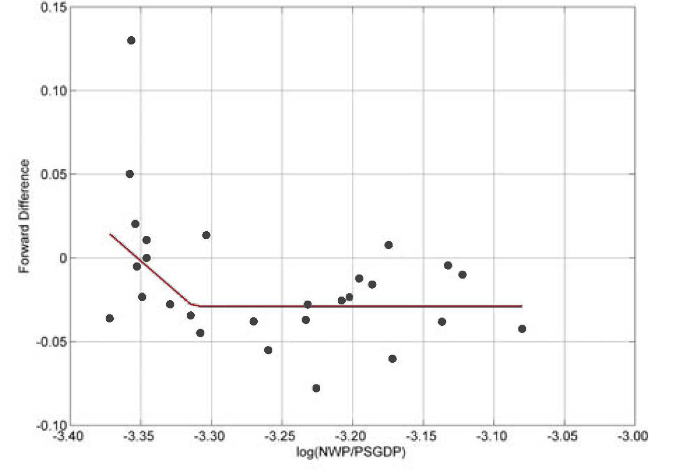
We used a “hockey stick” model to fit the empirical data. Specifically, we fit the model
Yt+1−Yt=a+b⋅min(Yt,c)+εDOWN ,t′
where a, b, and c are parameters to be estimated. This is a nonlinear model, which could be estimated by either maximum likelihood estimation (MLE) or generalized least squares (GLS). However, these methods turned out to be unstable on this data. Therefore, we used a consistent two-stage algorithm to estimate the c parameter first, and the results were confirmed by both MLE and GLS.
The hockey stick pattern was also confirmed by locally weighted scatter plot smoothing (LOESS), which used bootstrapping and cross-validation to determine an optimal span value (Figure 9).[5]

Between LOESS and hockey stick, we chose the latter, because
-
LOESS gave too much weight to neighbor points, leading to insufficient smoothing. For example, the convex pattern between −3.2 and −3.1 was judged not more credible than a horizontal line (as the hockey stick model indicates). In other words, LOESS may cause an over-fitting problem.
-
Due to the small sample size, the training set for cross-validation is also small, causing the optimal span value for LOESS to be volatile.
We believe that the hockey stick model represents the pattern well. It is also computationally more efficient than LOESS.
The equation we estimated is
Yt+1−Yt=−2.4358−0.7266⋅min(Yt,−3.3129)+εDowN,t
The variance of residual terms is 0.0012. Again, at a 5% significance level, we cannot reject the normal distribution hypothesis for residuals, using both the Lilliefors test and a chi-square goodness-of-fit test.[6] Therefore, we will assume that εDOWN,t ≈ N(0,0.0012).
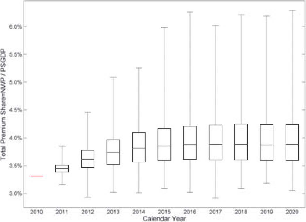
Simulation Results. The preceding fully specifies the procedure to simulate Yt = log(NWP/PSGDP) and therefore also total premium share NWP/PSGDP = exp(Yt). Figure 10 gives four examples of paths generated from the simulation model.

For a 5,000 iteration simulation, Figure 11 gives a summarized box plot for each accident year.

On each box, the central red mark represents the median, the edges of the box are the 25th and 75th percentiles, and the whiskers extend to the most extreme data points.
The TPS is 3.43% in calendar year 2009. To estimate 2010 data, we use information from the first three quarters in this year, rather than a regime-switching model. Starting from year 2011, the simulation method is implemented. The 2011 results are distributed approximately symmetrically around the 2009 level, and the variation is narrow. For calendar year 2012 and beyond, the right tail is growing, indicating a higher possibility of price increments.
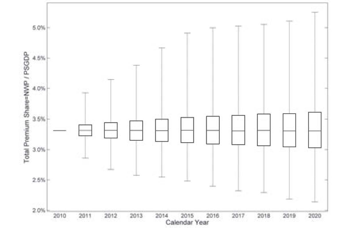
Figure 12 shows comparable simulation results from an AR(2) model fit to the TPS data. (A lag of 2 was selected by the Akaike Information Criterion as the most suitable up to 5 lags.) The future median converges to 0.0332, which is lower than both 1984 and 2000 TPS (shown in Figure 4 to be the bottoms of two soft markets). This strange result is mainly due to the linear/symmetric nature of the AR model.

3. Pricing risk and reserving risk benchmarks
3.1. Data
We have compiled data from the annual statement Schedule P for each U.S. insurer, by line of business, both gross and net of reinsurance, for accident years 1987 to 2009. This includes paid, incurred, and IBNR loss and expense triangles as well as earned premium.
Moreover, we have tested the data for consistency from one annual statement year to the next. The data must be adjusted for mergers and acquisitions activity, and for other changes that result in a restatement of historical data.
In order to clearly define pricing and reserving risk benchmarks, we need to make the following clarifications:
Gross or net of reinsurance. We note that companies may have different results before and after applying reinsurance. We calculate risk benchmarks using both gross and net premium and loss triangles. Note that while the net loss triangles have 23 accident years (1987–2009), we only have 14 accident years of gross loss triangles data (1996–2009).
Unit of observation. We need to specify the unit of observation. Computed volatility depends on the data sample. A small premium size tends to generate higher statistical volatility of loss ratios. Consolidating premium and loss data across companies will reduce the statistical volatility of loss ratios. We have defined the unit of observation as either consolidated for the whole industry, consolidated for all companies in a segment, or for each company group.
To determine the company group level, we used SNL insurance company groups (and subgroups on some occasions). A company group may have many operating companies. We only keep company groups whose minimum entry in the premium triangle is at least $1 million. This leaves us with 730 company groups.
To determine the segment level, we divided the 730 company groups into seven segments, listed in Table 1. See appendix for definitions.
In this paper, we estimate risk benchmarks for the following segments: 1) Large National, 2) Super Regional, and 3) Small Regional.
Please keep in mind the heterogeneity of individual firms’ experience. While individual firms tend to correlate with the industry-wide experience, an individual firm’s volatility is also affected by its own corporate strategy, underwriting practice, and a host of other firm-specific factors. While it would be interesting to analyze different growth strategies and firm characteristics, in this paper we simply classify firms according to the markets in which they operate (Large National, Super Regional, and Small Regional).
Lines of Business: We study benchmarks of pricing risks and reserving development risks for eight major lines of business (LOB).
-
Private Passenger Auto Liability
-
Commercial Auto Liability
-
Workers Compensation
-
Other Liability Occurrence and Claims-Made combined (i.e., general liability)
-
Product Liability Occurrence
-
Medical Professional Liability Occurrence and Claims-Made combined
-
Commercial Multiple Peril
-
Homeowners
Product Liability Occurrence and Medical Malpractice Liability are not separated into three segments due to the small number of companies in these lines of business.
The appendix provides more detail on our data and segmentation methodology.
3.2. Pricing risk benchmarks
3.2.1. Coefficient of variation of the gross loss ratio by line of business and segment
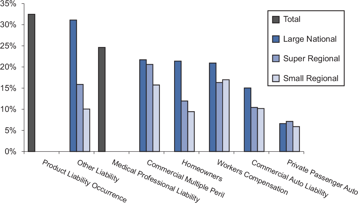
Figure 13 and its accompanying Table 2 show the coefficient of variation (standard deviation/mean) of the gross loss ratio across years, pooled by segment and line of business.

Figure 13 shows that
-
Aggregated by segment and line of business, the ultimate loss ratios (for accident years 1987–2000, it refers to the developed loss ratios at 120 months) or latest-reported loss ratios (for accident years 2001 to 2004) vary across accident years the most for Product Liability and the least for Private Passenger Auto.
-
The Large National segment shows a higher coefficient of variation than do the Super Regional and Small Regional segments. This pattern holds for almost every line of business, with the exception being Private Passenger Auto Liability. This suggests important differences in pricing behaviors between firms in different segments. A similar finding was reported in Wang and Faber (2006) which was based on a limited sample analysis.
3.2.2. Coefficient of variation of the net loss ratio by line of business and segment
Figure 14 shows the coefficient of variation of the net loss ratio by segment and line of business. Observations can be made on the net loss ratios that are similar to those on the gross loss ratios (see Table 3).

3.2.3. Variability of the ultimate loss ratio for large firms versus small firms
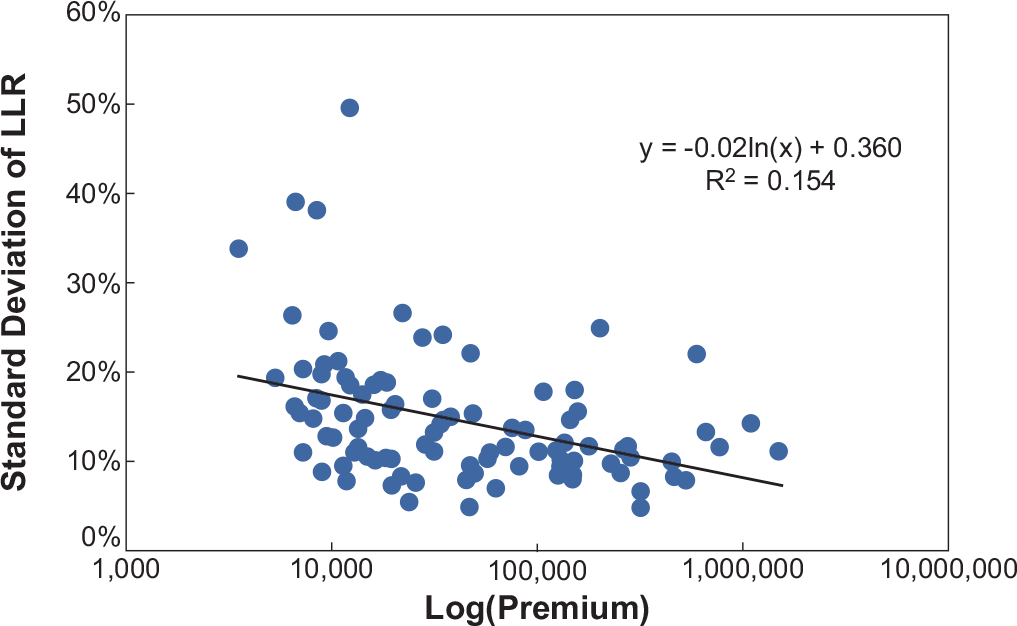
Previously, we saw that the aggregate loss ratio variation is lowest for Private Passenger Auto in the Small Regional segment and highest for Product Liability Occurrence. Here, we explore that variation across individual firms, and, in particular, ask whether larger firms experience less variation than smaller firms (as might be expected).
In the following charts, each dot represents one firm. The horizontal axis represents the average, across accident years, of the net earned premium for the firm in the specified LOB. A logarithmic scale is used because of the large variation across companies. The vertical axis measures the standard deviation of the ultimate loss ratio for the firm in the specified LOB, gross or net, across accident years.
With 135 companies writing Private Passenger Auto business (Figure 15), we can see that larger firms do tend to have lower volatility than small firms, as implied by the law of large numbers.

Such a significant negative relationship can also be found in Commercial Auto Liability (Figure 16), with a sample of 99 companies.

Remark: Figure 14 shows coefficient of variation (CV) for segments on an aggregate basis, while Figure 15 shows standard deviation of net ultimate loss ratios for individual company groups. Small company groups in the Super and Small Regional Segments tend to have higher CV, but when aggregated over each segment (Figure 14), their CVs are lower than for Larger Nationals Segment.
For Other Liability, however, we get a counterintuitive but statistically significant result: among 99 companies, larger firms are more volatile, as shown in Figure 17. This suggests systematic effects of firm size on pricing behavior, mix of business (e.g., Professional Liability, excess, or high deductible policies) or underwriting (larger, more volatile risks).

Other lines of business did not show significant relationships in either direction.
3.3. Reserving risk benchmarks
3.3.1. Reserving risk benchmarks by line of business
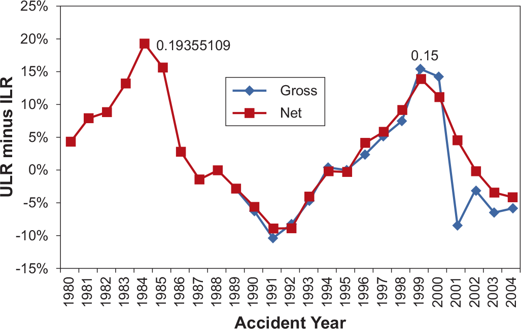
Figure 18 shows the historical reserve development, expressed in terms of revisions of reported accident year loss ratios. The horizontal axis represents the accident year. The vertical axis measures the difference between latest report (at 120 months of development or less)[7] and first report (at 12 months of development) of the industry aggregate loss ratio for a specified line of business on both a net and gross basis.

We call the latest reported loss ratio the Ultimate Loss Ratio and the first reported loss ratio the Initial Loss Ratio. The reserve risk benchmark is defined as the maximum difference between the Ultimate Loss ratio and the Initial Loss ratio across all accident years. For each graph, we label where this maximum occurs.
The reserving risk for Commercial Auto Liability on a gross basis is 15%, the maximum of {Ultimate Loss Ratio − Initial Loss Ratio} across accident years 1989–2004. The reserve risk for Commercial Auto Liability on a net basis is 19%, the maximum of {Ultimate Loss Ratio − Initial Loss Ratio} across accident years 1980–2004. It is noted that the reserving risk for gross versus net are based on data from different time spans and thus are not directly comparable.
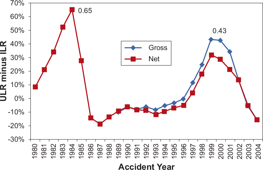
Figure 19 shows the reserving risk for Other Liability.

A summary of the reserving risk for all lines of business is in Table 4.
3.3.2. Reserving risk benchmark by line of business and segment
The preceding section measured reserving risk at the line of business level. To investigate whether reserving risk differs across different segments, we study aggregate segment level data (with net loss data for accident years 1987–2004 and gross loss data for accident years 1996–2004).
Using consolidated gross loss ratio data of all companies within a segment, we get the following segment-level reserve risk benchmarks (see Table 5). Due to high variation of loss ratios, we measure a relative, rather than absolute, change in loss ratio: the Ultimate Loss Ratio divided by the Initial Loss Ratio less 1 (ULR/ILR − 1). Note that small or negative values of this metric do not imply there is no reserving risk.
Using consolidated net loss ratio data of all companies within a segment, we get the following reserving risk benchmarks (see Table 6).
Observe that Large Nationals (on a consolidated basis) again tend to show higher reserve risk benchmarks than Super Regional and Small Regional companies. This, again, is probably due to differences in behavior.
3.4. Correlation benchmarks
3.4.1. Correlation of accident year ultimate loss ratios between lines of business
Using A.M. Best data for accident years 1980–2006, we calculated correlations of ultimate loss ratios aggregated for the industry, across accident years, between lines of business, using Spearman’s rank correlation. For example, if, for two lines of business, the highest loss ratio[8] falls in the same accident year, and the second highest loss ratio for both lines also falls in the same accident year, and so on, then we will calculate a 100% correlation between the two lines.
For both Table 7 and Table 8, correlations over 38% are statistically significant at the p = 5% level.
3.4.2. Correlation matrix of accident year reserve development across lines of business
The correlation of reserve development is done by calculating the correlation of the Ultimate Loss ratio divided by the Initial Loss ratio less 1 (ULR / ILR − 1). This also uses Spearman’s rank correlation.
The reserve development correlation matrix shows higher correlations than are generally seen when estimating the correlation between incremental losses in the triangle, which is another method to obtain correlations. However, the incremental loss method is too granular—the correlation between incremental losses is not the correlation of the whole reserve, as each individual incremental loss is not independent of the next. Instead, there exists autocorrelation—that is, there is a reserving cycle that is a common thread through all lines of business.
4. Conclusions
In this paper, we have modeled the underwriting cycle using the total premium share (net written premium over private sector GDP) as a proxy for the pricing index. By observing the historical behavior of the TPS, we determined that the downward and upward regimes of the cycle behave in different ways, and so a regime-switching model was created instead of the usual autoregressive model. Using our extensive database of 730 company groups, we also estimated benchmark pricing and reserving risks by line of business and by industry segment (Large National, Super Regional, and Small Regional), as well as the correlation between lines of business at an industry-wide level.
These results can be used as a guide in selecting risk parameters for enterprise risk models as well as augmenting those models to include explicit underwriting cycle effects.