


1. Introduction
Climate change[1] is one of humanity’s most significant and adverse challenges of the 21st century—one of the “biggest threats modern humans have ever faced” (United Nations 2020). The resulting increase in catastrophic weather events over the last few decades has led to previously rare events now occurring more often. Without intervention, these natural disasters will increase to catastrophic levels by 2100 (Fawzy et al. 2020; Prudential Regulation Authority 2015). A recent study by Thistlethwaite et al. (2018) showed that, without intervention, the prevailing climate scenario could increase annual flood losses in Canada by as much as 300% by the end of the century. And this finding did not consider potential increased exposure.
Born (2019) showed that climate change is adversely affecting polar bears, but its impact is also evident in more expansive areas, such as observed increases in the prevalence of waterborne and vector-borne diseases and the impact of natural disasters on human socioeconomic well-being (Watts, Amann, Arnell, et al. 2019). Every natural disaster has direct and indirect impacts on the physical infrastructure, including buildings and road networks, as well as on the social infrastructure, including health services, educational facilities, and the economy.
Additionally, varying exposures render some segments of the population, such as the elderly, children, and people with underlying health conditions, more vulnerable to climate change effects (Whitmore-Williams et al. 2017). Recent research has also found that psychological responses to climate change—what Clayton (2020) refers to as “climate anxiety”—are associated with increased mental health issues (Morganstein and Ursano 2020).
Insurance companies have a primary role in protecting against losses that may be devastating to individual entities. They do so by capitalizing on the law of large numbers—pooling individual risks allows them to indemnify their clients against devastating costs from covered perils.
Casualty actuaries have historically used generalized linear models (GLMs) to model weather-related event frequencies. GLMs are considered the best alternative for modeling count data (Wood 2006) and, consequently, a natural choice when modeling weather-related event frequencies. Research has illustrated their advantage over other models (O’Hara and Kotze 2010; Ives 2015). However, such numerical prediction models for weather-event frequencies are not only inappropriate when data are limited (Warton et al. 2016) but are also overly complex. They use high computing power and expensive hardware, making them an expensive venture (Trebing, Staǹczyk, and Mehrkanoon 2021).
Most catastrophe models[2] are designed to simulate the physical phenomenon of various natural disasters by simulating several events and their associated probabilities and occurrence scenarios and then using these outcomes to estimate the expected loss for a given portfolio. This involves tracking a weather event’s entire life cycle. For example, simulating typhoons requires developing a catastrophe model that begins tracking a typhoon as soon as a depression system forms in the ocean, then continuing to track as the typhoon travels toward land and across several countries. Data collection must include the type of impact, potential damages, and financial losses incurred. In addition to the financial risk aspects of catastrophes, it is essential to consider other factors, such as resiliency, emergency planning, and asset management. To do this, scientists rely on climate science, data quality, and catastrophe modeling.
However, catastrophic weather-related events are now occurring more often than the current catastrophe (cat) models can predict (Rotich 2017), leading to a capital base within the reinsurance sector that has increased to a record high of $605 billion (Seekings and Anderson 2017). Despite this high capital base, the losses incurred from catastrophes have been immense. For example, the aftermath of hurricanes Irma and Harvey, which were devastating, dealt a sharp blow to the reinsurance industry, with the worst losses ever recorded, totaling slightly under $200 billion. Despite the over-capitalization of the reinsurance sector, it will be challenging to cover losses from such extreme events if reinsurers continue using their current models (Seekings and Anderson 2017).
It is essential to note three things. First, the ballooning insured losses have not emanated solely from the increased frequency of catastrophes; new entrants into the insurance sector, such as agriculture, have also contributed (Jørgensen, Termansen, and Pascual 2020). Second, the increased frequency of catastrophes can be attributed to both climate change and improved reporting (World Meteorological Organisation 2021); however, the number of deaths has decreased due to improved early warnings and better disaster management. Finally, the increasingly devastating effects of these disasters are primarily driven by population growth and distribution. For example, high-density urban cities are more vulnerable to devastating disasters (Donner and Rodriguez 2011).
Even with sophisticated cat models, temporal and spatial uncertainty are still significant factors (Thistlethwaite and Wood 2018), partly because of limited data. Even with increasing frequencies, rare events are not frequent enough to generate sufficient data. The biggest challenges for the cat models are climate change hazards, including accurate representation of climate change uncertainty, modeling correlations between perils, modeling turbulent processes in the atmospheric boundary layer and other weather-related perils, and so forth (Jewson, Herweijer, and Khare 2016). Therefore, methodologies that can produce accurate results with limited data are vital assets for an insurer’s claim management arsenal. These methodologies can be used to build internal models, which, in turn, can be used to calibrate the vendor-supplied cat models; or the outputs can be used for validation to help establish an accurate representation of the probability distribution of losses.
Sousounis (2021) established that industry concerns are rooted in three main areas:
-
Climate change leads to significant alterations of weather-event frequencies and intensity. However, cat models are built on long-term historical datasets, which do not address recent changes.
-
Cat models also lack a straightforward method, such as a scaling factor, that can account for the impact of climate change.
-
Climate change will continue to drive adverse weather effects.
Therefore, models that can be used to generate early warnings play an increasingly significant role in disaster and loss management.
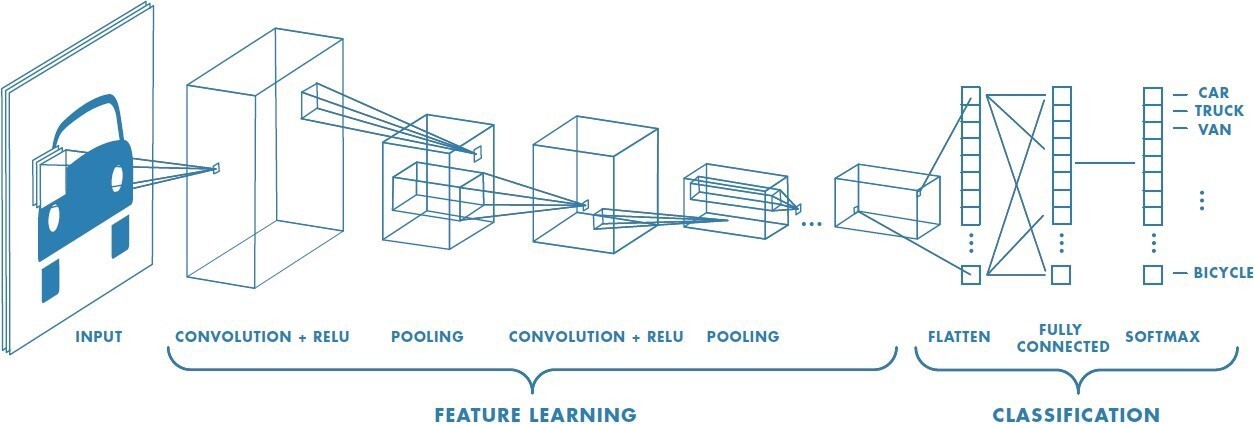
Recent studies have alluded to the potential for advances in artificial intelligence to solve some of these shortcomings. In a comprehensive study on how machine learning (ML) techniques can be used to tackle the climate change problem, Rolnick, Donti, Kaack, et al. (2019) presented possible model architectures[3] for modeling weather-related event frequencies. The authors explored ML applications in various areas, including modeling, forecasting, and building predictive ML models. They also illustrated various applications for different ML techniques, such as convolutional neural networks (CNN) (LeCun, Boser, Denker, et al. 1989).
CNN models use images as inputs (see Section 2.2 and Appendix C for more details on CNN). Table B1 in Appendix B summarizes previous studies that investigated using ML applications for weather-event modeling, including the inputs used to build the respective models, the network models used, and the performance measures used to evaluate the models.
Briefly, CNNs comprise a branch of deep learning with multilayered neural networks that use ImageNet datasets with millions of labeled images and abundant computing resources to analyze visual imagery. CNN uses convolution, the mathematical operation of two functions that produce a third function, to show how the shape of one is modified by another (Mandal 2021).
Studies have shown CNN’s potential effectiveness for thresholding and clustering satellite images into grids to identify disaster-affected areas (Doshi, Basu, and Pang 2018). Liu, Racah, Correa, et al. (2016) found that CNN accurately characterizes extreme weather events using a broad set of patterns from labeled data.
Our study aimed to illustrate the application of image processing techniques in modeling weather-event frequencies. In particular, we illustrate CNN’s ability to model weather-event frequency when numerical data are unavailable or limited. Additionally, as shown by Scher and Messori (2018), assigning a scalar value of confidence to medium-range forecasts initialized from an atmospheric state allows us to estimate future forecast uncertainty from past forecasts. Actuaries can use CNN techniques to calibrate commercial or third-party cat models and depict increased frequencies based on more recent, expensed, and focused satellite images. They can also use the results to validate output from cat models, especially where data are limited, as they are in most cases. Additionally, these techniques have a potential application for providing early warnings to bolster disaster preparedness, which, as highlighted earlier, plays a significant role in minimizing disaster-related deaths.
Introducing ML techniques into the catastrophe models used in weather-event frequency studies may lead to improved models. Ghosh, Bergman, and Dodov (2020) reported that an exceptional feature of ML, particularly CNN, is its potential to detect and classify features in imagery. The authors found that the CNN algorithm can be trained on a set of previously identified high-rise buildings to execute visual identification in aerial imagery by identifying shadows, patterns, and shapes found in the training data. This suggests that CNN models can be designed to use satellite imagery in the absence of sufficient raw data. Based on this premise, we built CNN models by applying Ronneberger et al.'s (2015) U-Net architecture and compared our model’s results with those from more traditional GLMs.
Our study’s contribution is threefold. First, to the best of our knowledge, this is the first study to apply image processing using U-Net architecture to build a model for catastrophic events. Also, to the best of our knowledge, our study is the first to evaluate the predictive power of U-Net and GLMs. We not only evaluated the U-Net architecture but also investigated its effectiveness using sparse data to test the claim that it performs significantly better than other models.
Second, given the increasingly broad impact of natural disasters on communities, accurate modeling of such events will increase financial cushioning and preparedness. Our study results may therefore reduce the impact of such events on humans’ socioeconomic well-being. Finally, by applying a CNN architecture, our model extracts and uses the temporal and spatial dependencies within the data, improving the model’s effectiveness in predicting weather-related catastrophic events.
This study does not explore the complete cycle of catastrophe modeling, which would involve scenario analysis and stress tests to establish the bounds of an event’s impact. The study used weather-event frequency and severity[4] as target variables and longitude and latitude data as inputs. To measure model performance, we used performance measures such as mean absolute error (MAE), accuracy false alarm rate (FAR), and F1 scores, among other measures, as discussed in Section 5.5.
The rest of the paper is organized as follows: Section 2 describes the study’s methodologies, including neural network, CNN, U-Net, and GLM. Section 3 describes the study data. Section 4 describes the exploratory data analysis, followed by a description of the methods and models fitted and the model evaluation methods in Section 5. Results are then presented in Section 6, and the paper concludes with a discussion of the results and concluding remarks in Section 7.
2. Methods
GLMs have long been part of an actuary’s assortment of modeling tools for solving various problems (Goldburd et al. 2025). However, neural networks have been gaining traction owing to their ability to more closely mimic reality. This study evaluates the CNN model, particularly the U-Net architecture. Understanding how a basic artificial neural network (ANN) works is essential to understanding CNN. Therefore, we begin by discussing a simplified ANN architecture and how it is used for modeling. Since neural networks are often viewed as black boxes (Z. Zhang et al. 2018), we demystify them in Appendix A by providing a high-level summary of similarities and differences between ANNs and GLMs.
2.1. Artificial neural network
ANNs (or just neural networks for short), have been applied in many different fields after first being discussed in McCulloch and Pitts’s (1943) study on computational models for neural networks. Werbos’s (1974)[5] study introducing backpropagation (i.e., backward propagation of errors) sparked renewed interest. Thought to belong to the nonparametric class, ANNs have been widely adopted because of their ability to “learn” the input data’s behavior and thereby provide more accurate output (England 2008). Figure 1 shows a simplified representation of how a neural network works (see Guresen and Kayakutlu 2011; Z. Zhang et al. 2018; Zupan 1994; and the references therein for a more detailed discussion on neural networks, including their mathematical formulations).
Briefly, a layer is made up of nodes. The arrows represent the associations and/or the direction of the association. The input layer receives data to be analyzed, a single layer where the number of nodes equals the number of input variables, which can associate with more than one node on the hidden layer. The hidden layer manipulates the data and relays the result to the output layer. The number of layers depends on the problem being analyzed, with the number of nodes in each layer equal to the number of data categories (factors).
In most cases, a single hidden layer is optimal (Lowe and Pryor 1996). Weights are then assigned to the different associations between adjacent layers. If there is no hidden layer, it is a linear regression model. The output layer is composed of a single node that relays the model’s output. However, it is possible to have more than one ANN ensembled so that the output layer has more than one output.
In a backpropagation ANN model,[6] modeling typically starts with an initial known output value called the “seed.” Initial weights defining the relationship between nodes i and j of two adjacent layers are defined, including initial biases. Using the input data and the “seed,” the model readjusts the weights and associated biases. This self-calibration is called model training. The training stops by reaching either a specified number of iterations or minimum variance. Making the error zero will likely lead to overfitting; therefore, best practice is to minimize the variance.
.png)
Despite the efforts to explain what happens in the hidden layer, ANN models remain a “black box” to many (Z. Zhang et al. 2018)—often because there is no clear relationship between the inputs and the model’s output. This makes it difficult to understand the output and to interpret the results. Consequently, checking the model’s validity and deciding on its appropriate structure (e.g., the number of hidden layers) can be challenging. Some argue that constructing an ANN model is subjective. The main concern remains overfitting.
2.2. Convolutional neural network
A CNN is another architecture used for deep learning exercises, where the inputs are images.[7] First introduced by LeCun, Boser, Denker, et al. (1989), CNNs have outperformed standard feed-forward classification neural networks because they can extract and use the temporal and spatial dependencies in the input image. CNNs are anchored on the principle that any image can be considered a binary representation of features of underlying data. It can therefore be broken down into smaller building blocks (pixels), which are arranged on a grid and contain information about the image’s characteristics (see Figure 2).
Just like ANN, CNN can assign weights and biases to the features defining the image; however, CNN does this with minimal preprocessing. Typically, CNN comprises convolutional, hidden, and fully connected layers, as shown in Figure 3. The convolutional layer does most of the computation. First, it takes a matrix of features to be learned by the network and the matrix of the restricted receptive field section and performs a dot product of the two. The restricted receptive field section is also called the local receptive field. Contrary to ANN, where each node from the input layer is connected to another node in the hidden layer, with CNN, only the local receptive field connects to the hidden layer. To generate the local receptive field feature matrix, the image from the input layer is first converted to a feature map, which is then relayed to the hidden layer. This process is efficiently implemented through convolution.
Similar to ANN, CNN training involves estimating weights and biases, which are continuously updated during the training process. Unlike ANN, these weights and biases are unchanged for a given hidden layer; therefore, the model is effectively tolerant to any image feature translation and will recognize these features whenever they are present. This is possible because every node within the hidden layer is detecting (learning) the same image feature. Consequently, a model with more hidden layers can learn more features. This explains why a CNN model can have a substantially larger number of hidden layers than an ANN model.
Finally, the output from each neuron is transformed using an activation function by taking these outputs and mapping them to the highest value. However, if the highest value is negative, the transformation process is repeated with a condensed output. Through a process known as pooling, the output from smaller parts is condensed into a single output by reducing the dimension of the feature map, which helps reduce the parameters to be learned and hence the run time. The final hidden layer then connects all its nodes to the final layers, collating the feature output to form the final image (see Höhlein et al. 2020; Liu, Racah, Correa, et al. 2016; Stankovic and Mandic 2021; and their accompanying references for a detailed discussion on CNN, including their mathematical formulations and their application in extreme weather modeling).
2.3. Convolution neural network (U-Net architecture)
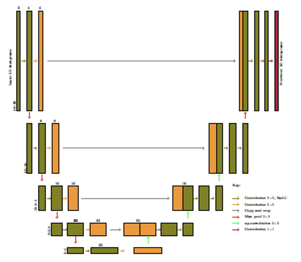
U-Net architecture is specific to CNN and designed for semantic segmentation.[8] Developed by Ronneberger, Fischer, and Brox (2015) to be used for biomedical image segmentation, CNN U-Net (henceforth referred to as U-Net) has since been widely adopted in various fields (see, for example, Du et al. 2020; Sadeghi et al. 2020; Yao et al. 2018). As CNN architecture, U-Net has all the CNN properties plus the ability to localize and differentiate borders by classifying images based on each pixel, making the input and output have the same properties. Figure 4 shows a U-Net architecture. (For a more detailed description of the architecture and the accompanying mathematical formulations, see Ronneberger, Fischer, and Brox 2015.)
.jpeg)
U-Net architecture is symmetrical with two main parts: the encoder[9] and decoder[10] paths. The encoder path comprises a convolutional process described in Section 2.2. The decoder path comprises two-dimensional convolutional transposition.
First, the image enters the input layer from the left side of Figure 4. Convolutional operations are applied using two convolutional layers. Finally, the number of features to be mapped is specified. A process similar to the CNN model uses a three-dimensional feature matrix, commonly referred to as the kernel. The final convolutional layer comprises padding.[11] Next, pooling is implemented, reducing the image size by half. Pooling enables the model to focus on the most critical features of the input images by generating a two-by-two kernel, then using the previous output to select the max value to populate the two-by-two kernel. This process is repeated three times to reach the bottom of the architecture, which concludes the encoder path. The bottom convolutional operation differs from the previous operations in that the pooling operation is not applied, so the image size remains the same.
The decoder path is the reverse of the encoder path. Here, the image sizes are expanded through fractionally strided convolution by applying a padding exercise and then a convolutional operation. After the image size has been expanded, it is concatenated with the image from the encoder path.[12] Combining the information in the expanded image with that from the previous layer allows the U-Net to produce a prediction superior to other CNN architectures. Similar to the encoder path, the process is repeated three times. The last step involves reshaping the final image to meet the prediction requirements specified by the modeler. The final layer is always a single filter convolutional layer (see Ronneberger, Fischer, and Brox 2015, for a more detailed layer-by-layer description).
2.4. Generalized linear models
GLMs, popularized by McCullagh and Nelder (1989), model the relationship between a response variable and a predictor variable. GLMs have become a staple in the casualty actuary’s toolbox. The models assume that systematic and random components drive the response variable, so a GLM’s purpose is to explain as much of the systematic component as possible. It is assumed that the dependent variable is drawn from a distribution of the exponential family with a mean
EE[YY∣XX]=g−1(XXββ),
where and are the response and predictor variables, respectively. The modeling then reduces to the specification of the link function, and the modeling of the linear predictor
η=Xβ.
Our study focused on modeling weather-event frequency, which was our response variable. We assumed that these events follow a Poisson distribution, so we could model the mean using equation (2.1). If we assume a log link function, the linear predictor can then be modeled as
logλi=β0+βxi,
where is the Poisson distribution mean. Or equivalently,
g(λi)=β0+βxi.
For a comprehensive review of GLMs, including their extensions, see Dobson (2002), Dunn and Smyth (2018), Hardin and Hilbe (2006), and McCullagh and Nelder (1989).
3. Data
We obtained the study data from the National Oceanic and Atmospheric Administration (NOAA 2020), a government agency within the US Department of Commerce that provides information on the state of the oceans and atmosphere, including weather warnings and forecasts. We obtained historical data for storm events from 1950 to 2020 and used the Python programming language (Van Rossum and Drake 2009) to scrape data in a zipped format and convert it to comma-separated value (CSV) files, the most commonly used format due to ease of use (Hernández, Somnath, Yin, et al. 2020). Three files were generated for each year:
-
Storm event details
-
Storm event locations
-
Storm event losses, including fatalities caused by the storm event
We collated the three files, excluded data with missing location information, and generated an all-years dataset, which was filtered to only include the data needed for modeling. We used the data to generate exact event dates for modeling purposes.
All analyses were conducted using Python, which provides modern tools developed for ML problems (Sarkar, Bali, and Sharma 2018). All work presented in this paper is reproducible; the codes, data, and analyses we used are available on GitHub.[13]
4. Exploratory data analysis
The downloaded data contained a range of information relating to each weather event (see NOAA 2020, for a complete list and description of the data types). However, we only retained the information relevant to this study. One challenge we faced was inconsistency in data types and format over multiple years. For example, a million dollar amount was recorded as $1,000,000 in some years and $1000000.00 or $1m in other years, which required substantial data cleaning and correction prior to data visualization and analysis. Since we intended to use heatmaps to visualize and analyze the data, latitude and longitude data were critical because they provided each event’s exact location. Therefore, events that were missing latitude and/or longitude data were excluded from the analyses. We used Python’s DateTime library to generate the exact date of each storm event and its duration.
The next step involved data visualization. Figure 5 shows how the total number of yearly events evolved over the study period. Figure 5a shows that the number of annual storm events increased substantially between 1950 and 2020.[14] Additionally, the event numbers demonstrate a cyclical pattern, where an above-average number of events occurred every three to six years, but this cyclical pattern appears to be decreasing over time—that is, increased numbers of annual events occurred more frequently in recent years compared with earlier years.
__and_cumulative_numbers_of_events_that_occur.png)
In other words, the frequency of extreme weather events has consistently increased over the years. Furthermore, the number of annual events has more than doubled over the last two decades.
Figure 5b shows the cumulative number of events occurring in each state. It shows that most extreme weather events occurred in four US states: Texas, Kansas, Oklahoma, and Missouri, and that the eastern states are more susceptible to extreme weather events. However, it is essential to note that the intensity of these weather events were not considered in Figure 5b. Therefore, events that may occur over several days, such as wildfires, are counted as a single event, without considering the number of days a fire continued to burn, for example.
Figure 6 shows weather-event frequencies between 1950 and 2020 by type (tornado, hail, and thunderstorm wind). Conclusions drawn from Figure 6 are similar to those drawn from Figure 5.

Figure 7a shows that thunderstorm winds and hail are the two most prominent extreme events in the US. Figure 7b illustrates hail severity using a heatmap generated from the longitude and latitude coordinates in the dataset that provided the exact location of weather events on a US map.[15] This process required linking map limit coordinates to image pixel coordinates. For this study, we used 1 LON degree = 28 pixels and 1 LAT degree = 37 pixels, and we used a small point of 4×4 pixels to plot the events on a US map to produce a very detailed event map.
__and_cumulative_number_of_events_that_occurr.png)
The plot shades reflect event intensity, where darker areas indicate higher event intensity. For example, Figure 7b illustrates the distribution of hail in the US over the study period, showing that hail events are concentrated in the eastern part of the US, corroborating the observation in Figure 5b. Maps can be generated to show the distribution of events by various factors, (e.g., per state/per year, per year/per event type/per state, etc.).[16] Heatmaps can also be generated for any unit of time per event and can use animated display libraries to generate dynamic heatmaps for each event type.[17]
To visualize these weather events, we generated heat maps using the longitude and latitude coordinates to place the event’s exact location and magnitude[18] to capture event intensity. These outputs can be found on GitHub.
5. The models
This study illustrates how image processing[19] can be used to model the frequency and severity of catastrophic weather events when data are minimal or when only satellite images are available. Since cat models use data to produce simulations, the output data from our model can be used by actuaries to compare with external cat model output and hence can be used to calibrate cat models. Our model inputs are, therefore, images (maps) of the weather events to be modeled, which were generated using weather-event data to plot two-dimensional histograms.
5.1. Two-dimensional histograms
To set the scene, we introduce the concept of two-dimensional (2D) histograms. These are generalizations of the usual one-dimensional histograms with an extra dimension to show data density at any point in the usual (x, y) plane, also known as density map, density heatmap, or heatmap. These density maps are produced by grouping the (x, y) data points into bins based on their coordinates and then applying an aggregation function[20] to these groupings to calculate the tile color used to represent this bin on the map.
Essentially, a 2D histogram cuts the space into narrow ranges, like [x1, x2], [y1, y2], and makes a pixel for each range, putting there all the data points located in the given range, which results in a “heatmap image” with size [number_of_ranges_x, number_of_ranges_y]. For example, Figure 8 shows 2D histograms for thunderstorm wind and hail. These are [100,100] sized histograms with the coordinates constrained to ([–130, –64], [24, 50]). Comparing Figures 8b and 7b shows that a 2D histogram can be a good alternative for visualizing such events. The two graphs closely resemble each other, except that Figure 7b was generated by superimposing the event data points on a blank US map.
__and_cumulative_numbers_of_events_that_occu.png)
Using artificial intelligence advances in image processing, these images can be fed into a model as inputs to model and project future (next) image(s). A CNN model is an example of this. Given that “a picture is worth a thousand words,” such model outputs would be a lot easier to communicate. Additionally, the process is more effective because it negates the need to build a separate model to predict when the events will occur; only the number of events occurring over the prediction period need to be predicted. This makes the problem relatively easy to solve using ML and is less resource intensive, because most insurers are more interested in aggregate claims not exceeding a specific limit.
5.2. Model structure
We constructed six-month rolling periods for model validation. For example, we fitted the model using data from January 1, 1950, to December 31, 2000 to predict the next six months, then refitted the model using data from January 1, 1950, to January 31, 2001 to predict the next six months, and so on. For each of these periods, we generated density maps for the significant event types,[21] such as those shown in Figure 8, which were then used to predict future density maps. It is important to note that the bigger the density map,[22] the more accurate and detailed the map would be, but the more difficult it would be for the model to predict because of the additional pixels, and accuracy is also affected.
5.3. Fitting convolution neural network (U-Net architecture)
To fit a U-Net, we used the 2D histograms as model inputs. A total of 25,192 2D histograms were produced for each event type, corresponding to the number of days within the study period under consideration. We used image preprocessing to crop the images. Each pixel corresponds to the cumulative incidence of a specific event on a specified day within approximately two square miles.
For events such as earthquakes, the third dimension can represent the intensity. We used 20,153 images to train the model (training dataset), while the remaining 5,039 were used to test the trained model (testing dataset). A maximum of 1,000 epochs[23] were used to train the U-Net model. We then defined a rule to establish optimal epochs for each model, using a stopping rule if there was no increase in the loss function over the preceding 10 epochs. To achieve this, we used an Adam optimizer (Kingma and Ba 2014) with an initial learning rate of 0.001. To further improve model training, we used randomly selected images for every epoch to validate the model.
Three events in our dataset had complete data for all the years: tornadoes, hail, and thunderstorm wind (see Figure 6), so we used these events to fit the model. Therefore, the input to the U-Net model presented in Figure 9 is a set of three images corresponding to these three events, which forms the three channels. A U-Net advantage is its ability to take more than a single layer as input.
We used the training dataset to fit the model. The density maps model input had a dimension of 50 × 20. As shown in Figure 9, our model consisted of two convolutional operations. We then used four feature extractors (filters) to extract the essential features from the density maps. Each filter[24] was 3 × 3 × 3, where the last 3 is the number of channels in the model.
We used a rectified linear unit (ReLU) activation function and a batch size of 32. No padding was applied to avoid overcropping the density maps. We also used a stride size of 2. After the two convolutional operations were implemented, we performed a max pool operation to provide a focus on “what” is being modeled. In our density maps, this equates to zooming in on specific regions of the map to accurately model the number of events occurring within each pixel. In doing this, we lost the “where” of the occurrences of the events. By zooming in, we reduced the size of the density map. This operation was repeated until the last encoder operation of the model was reached.
The symmetric expanding path does the opposite of what the encoder path does. The concatenation operation shown by the gray arrow in Figure 9 is essential; it recovers the “where” of the density map. By up sampling, we walked back to the original size of the density map. Therefore, our model output was also a 50 × 20 density map.
5.4. Fitting a GLM
We fitted a traditional GLM to model event count, which we compared with the CNN model. Numerical data were used to fit a GLM model and the model used for forecasting, while the CNN is fitted using the generated images and the fitted model used for forecasting. For the GLM, we modeled event occurrences per day, per event type. It is impossible to model the number of events for exact locations, so the data were aggregated based on state. Consequently, we needed to build (number of event types) × (number of states) GLMs for event counts.
5.5. Model evaluation
We adopted MAE as the loss function, which calculates the average magnitude of the error between the predicted image outputs and the actual images. MAE was calculated as
MAE=∑ni=1yi−ˆyin,
where is the number of images used to fit the model, are the actual images, and are the image outputs predicted by the model. In addition, we calculated the precision,[25] accuracy FAR, F1 score, and recall of the models. Precision was defined as
Precision =TPTP+FP′
where true positives are correct predictions, while false positives are where the model predicts an event that actually does not occur. Accuracy was defined as
Accuracy =TP+TNTP+TN+FP+FN
where true negative is when the model truly predicts the absence of an event, and false positive is where the model predicts the absence of an event when an event actually occurs.
Similarly, the FAR was calculated as
FAR=FPTP+FP
The recall was estimated as
Recall =TPTP+FN.
Finally, the score was calculated as
F1=TPTP+0.5(FP+FN)=2× precision × recall precision + recall .
6. Results
Using Keras’s least absolute deviations regularization loss function (L1) to prevent overfitting, we fitted a U-Net model using the generated density maps. The input was an image, and the output was also an image of the same size and shape. A notable advantage of U-Net is that any image size can be used as an input since it is an end-to-end, fully convolutional network. This U-Net versatility is handy when modeling weather events where the images cropped to include only nonempty parts form an essential part of the modeling process.
We split the input data into test and training data, where the training data were used to train the model, and the test data were used to cross validate the model. This paper only presents results for hail. Similar conclusions can be drawn for both thunderstorm wind and tornadoes. The model’s accuracy can be improved by expanding the maps to contain cumulative events within a larger region, say a state. This would be useful if we were more interested in the aggregates of, say, state rather than the event’s actual location. This could provide useful data for state government preparedness.
MAE does not penalize outliers as heavily as root mean squared error (RMSE) or MSE. Therefore, we chose MAE to evaluate the fitted models. We selected the models that achieved the lowest validation loss. Figure 10 shows how the two models performed on the training dataset.

The first row represents the actual density maps, the second row represents the U-Net predictions, and the last row represents the GLM predictions. The images show that both models performed well. We then used these two models on the test dataset and produced similar graphs (see Figure 11). Comparing Figures 10 and 11 shows that the models seem to perform similarly on both training and test datasets. This indicates an absence of overfitting the data.
We used these models to calculate various measures, as summarized in Table 1. The U-Net model outperformed the GLM on all measures except F1 score. We then used the fitted U-Net model to predict the frequency of hail and compared it with the test data. Figure 12 shows the results.

While there was a lag in predicting the number of events, the model captured the cyclical nature of these events and predicted the peaks and troughs, specifically where the event counts were close to zero or zero. Generally, we can conclude that the fitted model accurately predicted the number of events. The cumulative number of events predicted by the model would be close to the actual occurrence within a cycle. One notable downside of the fitted GLM was that it consistently predicted the presence of events even when none occurred. Additionally, it did not perform well in mimicking the cyclical nature of the events. This was expected, especially given our chosen GLM.
7. Conclusions, limitations, and future work
7.1. Conclusions
Our study shows that, in general, the U-Net model performs better than the traditional GLM, even with limited data. Notably, the GLM we fitted predicted day-by-day, while it is possible to predict a period block using U-Net density maps. Additionally, U-Net allows multichannel use, making it possible to input more than one stack of density maps into the model. This allows incorporating the dependencies, if any, within the various images. It also allows faster and more efficient training time with fewer computing resources.

7.2. Limitations
A significant limitation of this study was an incomplete dataset. Most raw data entries were incomplete, with many missing latitude and longitude data. Using estimates for the missing data would have adversely affected the model’s accuracy. Therefore, a substantial volume of data had to be excluded, leaving a smaller sample size, which adversely affected model training and testing. For example, hurricanes, which cause substantial losses, were missing longitude and/or latitude data—the most critical data elements for this modeling exercise. Complete hurricane data were only available beginning with 2016, so most hurricane data from earlier years had to be excluded. Second, ML algorithms often work best when the data points are continuous and tightly close to each other, which limited the techniques that could be evaluated. Additionally, the events were sparse and unbalanced; therefore, for some periods, the generated heat maps were just blanks, which affected the model’s predictive performance. Only three event types had complete data for the entire study period. However, with more granular data, such limitations can easily be overcome.
7.3. Future work
With more data available, similar research can be done with a broader range of weather events. Additionally, mindful of the number of parameters to be estimated, a similar model with fewer parameters would allow less computer-intensive training and forecasting. It would also be interesting to compare U-Net with other CNN model extensions. For example, Liu, Racah, Correa, et al. (2016) promoted using deep CNN to accurately characterize extreme weather events and weather fronts. Hou et al. (2022) tested the ability of the CNN-LSTM (i.e., long short-term memory) model to predict hourly air temperature. Lee et al. (2020) asserted that ML techniques can be used to predict heavy rain damage. Doshi, Basu, and Pang (2018) recommended that CNN be applied to detect disaster-affected areas. It would be interesting to compare the performance of these models with that of the U-Net architecture, especially with limited data.
Competing interests
There were no known conflicts of interest at the time of submitting this paper. We also confirm that all the named authors have read and approved the submitted manuscript. Further, there is no one else who satisfies the criteria of this manuscript’s authorship who has not been listed. Finally, we wish to confirm that all the named authors approve of the authorship order.
