


1. Introduction
In property and casualty insurance, territory-based risk classification is useful for various insurance operations including marketing, underwriting, and ratemaking in cases when the underlying risk varies geographically. For many years, actuaries have employed techniques of territorial ratemaking to segment risk, with initial applications based primarily on limited data and judgment (Werner 1999).
Early attempts to incorporate territories into a statistical modeling framework primarily relied on treating territories as categorical variables. These categorical variables were used in generalized linear models (GLMs). Unfortunately, this approach can suffer if there are too many territories relative to the quantity of data available. Moreover, it does not consider geographical relationships among territories, such as proximity or spatial correlation. For example, if territories are defined by zip codes, there may be many zip codes for which very few observations are available, resulting in poor estimates of zip code relativities. Consequently, this approach is limited to cases in which large amounts of data are available, or else territories must be defined very broadly to ensure that territorial relativities are credible. On the other end, even if data are available for all the zip codes being observed, there may be too many zip codes, and hence categorical variables, for the model to handle.
More sophisticated attempts have used location-related data, which can be treated as numerical variables, opening the way to various statistical models that employ functions (e.g., splines) of latitude and longitude. These functions can be included either in a classical GLM framework or as a stand-alone approach to identifying territorial relativities. An interesting application is that of Guven (2004), which frames the problem as a multidimensional analysis taking advantage of polynomial functions that can be applied within a GLM.
Increases in data availability and advances in methodologies (such as in Taylor 2001) have led to sophisticated actuarial techniques based on geographic information systems (GIS). GIS is defined as a system for capturing and storing data related to positions on the Earth’s surface. The system can include data on people, such as population, income, or education level, as well as information about the landscape, such as the location of streams; different types of vegetation or soil; sites of factories, farms, and schools; and storm drains, roads, and electric power lines. Uncovering spatial patterns and relationships can be done in a more efficient way, taking advantage of seemingly unrelated variables.
An early example is provided by Christopherson and Werland (1996); the authors show how GIS can be used to draw a detailed topographic risk map that, when contrasted with the results of traditional territory rating, is a more detailed and representative picture of geographic risk. A more recent application is described by Blier-Wong et al. (2021), who take advantage of geographically enriched data to build spatial embeddings in order to obtain predictions with smaller bias and variance than those in other spatial interpolation models in most situations.
However, territorial ratemaking still remains a challenge, in part due to the unstructured nature of the problem (Guven 2004). The use of geodemographic variables to infer territorial signals (residual of a main effects model) can fail to adequately capture true “secular” geographic variances that are not correlated with the variables in question.
To overcome these obstacles, clustering methods have been explored with the goal of analyzing territorial signals directly while maintaining adequate credibility for individual territories. A variety of examples may be found in Begher et al. (2011) and Yao (2008), which consider a variety of distance functions and clustering algorithms, including k-means, variations on k-medoids, hierarchical clustering, fuzzy clustering, expectation maximization, agglomerative nesting, and others. Dimensionality reduction techniques like these may have the drawback that statistical noise or lack of credibility may set a limit on the benefit that can be realized from these algorithms. In addition, clustering of this sort may produce suboptimal results by grouping territories that appear similar but that have small, highly credible differences in risk.
One aspect of territorial rates that is left out of the discussion of the algorithms and methodologies mentioned above is any representation of the graph relations among territories. Territories often share similar risk characteristics not only due to their locations but also, it is important to note, due to their adjacency, travel between territories, and the presence of barriers between territories. These kinds of relationships can be considered within the domain of graph theory. Alongside new developments in the realm of spatial data science, in recent years, graph theory has established itself as an important mathematical tool in a wide variety of subjects ranging from geography to linguistics and chemistry (Wilson 2010).
In this paper, we propose a novel method of identifying and modeling structured relationships among territories using graph theory and related algorithms. Graph theory has been employed in a variety of actuarial contexts, such as Hartl (2010) investigating the use of graph theory to identify different missing data scenarios in development triangles and Parodi and Watson (2019) relying on graph theory to estimate fire and explosion losses within an individual property. Moreover, advances in graph neural networks (GNNs) offer an additional tool that can be employed in the context of graph analysis, as in Wu et al. (2022).
The remainder of this paper is structured as follows: Section 2 discusses how territories may be represented in graph theory, along with a primer on related terminology. Section 3 discusses specific graph theory territorial ratemaking models that will be applied. Section 4 discusses the results of these methods and compares them to standard territorial indications. Section 5 discusses conclusions and further studies.
2. Graph representations of territories
2.1. Introduction
A complete discussion of graph-theoretical concepts is beyond the scope of this paper; however, a gentle introduction to graph theory may be found in Wilson (2010).
For the purposes of this paper, it is necessary to understand that graph theory is concerned with objects called vertices or nodes that are connected by edges or links. A collection of vertices and edges is called a graph. Intuitively, a map of a region can be represented as a graph. For example, the centroids of zip code areas could be nodes. These nodes could be connected by edges. The edges themselves could represent adjacency relationships or distance or anything else, such as connectivity by public transit.
There are several additional concepts that may assist in the discussion and understanding of graphs. An edge connecting a node to itself is called a loop. A graph with no loops is described as a simple graph—this will be the focus of this paper. Edge relationships may be directed or undirected. A graph that has directed relationships is called a directed graph or digraph. An example might be a bus or subway map that shows that stops available for travel in one direction are not always the same as stops available for travel in another direction. In this case, it may be possible to go from station A to station B but not from station B to station A. This is a directed relationship. In particular, the concept of traveling from one vertex to another is described as a walk. A walk may be meandering, so a walk that never passes through a node more than once is given a special term and is described as a path.
In a graph, nodes may be ranked in terms of their centrality. Centrality measures the location of a node within a larger graph structure. Centrality can be measured in several ways, such as measuring the number of paths through a particular node. Nodes with more such paths might be said to be more central to the graph. Several measures of centrality are described below.
In a ratemaking context, it is intuitive to represent territories as nodes. If territory A is adjacent to territory B, then those territories could be connected by an edge. Information about territories may be stored at both the node level and the edge level.[1] For example, node-level information might include information about the location of each territory (i.e., latitude and longitude) or geodemographic information from that territory (weather information, population information, etc.).
Edge-level information codes relationships between territories such as adjacency (i.e., whether two territories touch), the nature of borders between territories, the existence of transportation routes, and the distance between territory centroids. There is significant flexibility in how territory information may be represented as a graph and the types of territorial information that may be encoded. Note that edge-level information in this way is a generalization of traditional distance measures: Instead of being confined to measuring the distance between territories in terms of physical distance, edge-level information can code more complex information that may be more meaningfully related to risk of loss than is geographic distance.
A territorial graph model may be used to directly estimate node-level information such as the loss cost in different territories (or the territory-level risk residual of some classification model). In addition, graph models may be used to classify nodes, such as for grouping territories into higher- and lower-risk groups. Graph models can also be used to develop node-level “embeddings” that may be employed in standard GLMs to improve predictive accuracy. These strategies are discussed further in the following section.
2.2. Euclidean versus graph structures
Given a particular graph representation of a set of territories, models may be employed that rely in different ways on the graph structure. Graph models have somewhat different requirements from more familiar models due to the nature of graph structure. Understanding these differences is important to understanding how graph models work and how they may differ from traditional models.
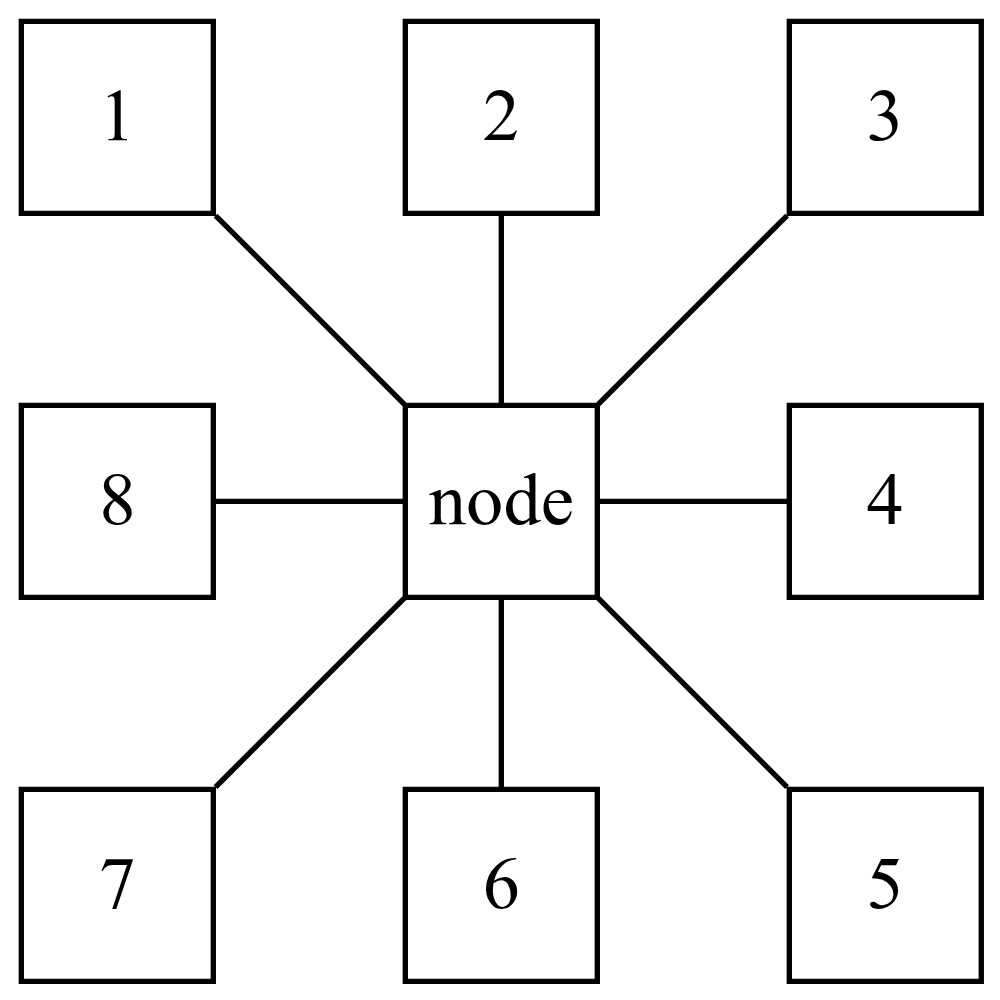
Consider a geographic model wherein risk varies according to latitude and longitude in a region, state, or country. Suppose for the sake of illustration that the region in question is divided into a rectangular grid of cells that are one square mile each. In this case, each cell in the interior of the region could be thought of as being adjacent to eight other cells that form a “box” around that cell. An example of this may be seen in Figure 1.

In this new example, territory 2 is connected to territories 1, 3, and 4, but it is not connected to territory 5 and 6 except indirectly through territory 1. These territories no longer represent grid cells in a map but may instead represent general regions. For example, these may represent separate cities that are connected by air travel through a particular airline carrier.
If the nodes were taken to represent zip codes, then the “distance” between two nodes could be thought of in terms of the Euclidean distance between the zip code centroids. That said, in some circumstances, the zip code may be very large, and that distance may fail to fully capture the nature of the relationships among zip codes. Similarly, there may be a large natural boundary between two adjacent zip codes (a river, for example, or a mountain range), such that risks in one zip code may be very different from those in the adjacent zip code in spite of physical proximity.
A graph can address these issues by generalizing the concept of distance. It does this by coding multiple pieces of information across edges: the number of highways connecting two states, the elevation change between two counties, whether a river divides two territories, etc. Simple adjacency relationships by themselves may be thought of as a “distance” function with a value of 1 in the case where two territories are adjacent and 0 otherwise. In some cases, the physical distance between or number of highways connecting two territories may be less relevant than the number of individuals who regularly drive from one territory to the other. The information that is best to consider will vary depending on the particular area of application.
Note that these edges may carry numerical, binary, or categorical data. For these reasons, graphs differ from standard models in three key ways:
-
Each node in the graph is associated with a variable number of adjacent nodes. In the Euclidean grid representation (see Figure 1), each node is associated with eight other nodes. In a general graph, a node may be considered “adjacent” to anywhere from 0 to N other nodes, where N is the total number of nodes in the graph. Note that in the case of 0, the node is not considered “adjacent” to itself, whereas in the case of “N” the node must be adjacent to itself.
-
Graphs are permutation invariant (Zhou et al. 2020). This is not generally “important” in the case of territorial ratemaking, because territories do not move around. However, in other applications of graph theory, it may be important. As an example, a graph model of a molecule should provide the same representation of relationships among the constituent atoms if the molecule is rotated upside down. That is, the locations of the nodes in a graph do not matter, only the connections between the nodes. Once again, this is not strictly relevant to territories, but it does influence graph models in other contexts. Due to this requirement, GNNs are designed to be permutation invariant.
-
Graphs are non-Euclidean (Zhou et al. 2020). Because the edges between nodes can code for many kinds of numerical or categorical information, the “distance” between two nodes is not clearly defined in terms of the Euclidean distance.
2.3. Centrality measures
As discussed previously, centrality is a measure that is related to the location of a node. Specifically, as the term implies, centrality is a measure of a node’s “importance” within a graph structure. There are many measures of centrality described in Borgatti (2005). Four that are relied on in this paper are described briefly below.
2.3.1. Degree centrality
Degree centrality is one of the simplest measures of centrality and is defined as the degree of a node, i.e., the number of connections of a node. For example, in Figure 1, the central node has degree 8. A simple way to calculate the degree centrality of each node is to take the sum of rows in an adjacency matrix that represents the graph structure.
2.3.2. Betweenness centrality
Betweenness centrality is defined as the sum
g(b)=∑a≠b≠cσac(b)σac,
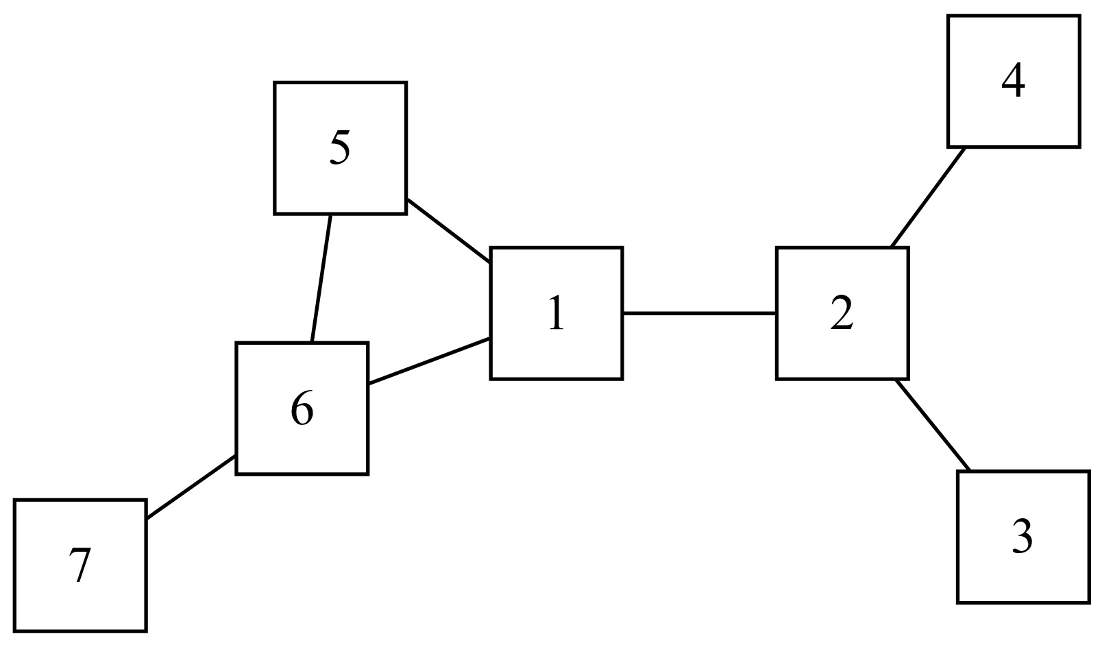
where is the set of shortest paths between points and while is the set of shortest paths that include the node Therefore, the betweenness centrality measure for is a measure of the number of shortest paths between points in a graph that necessarily include
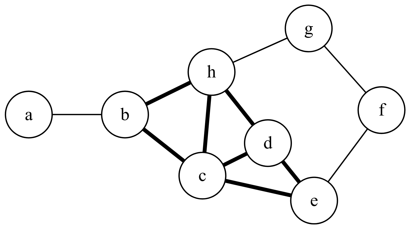
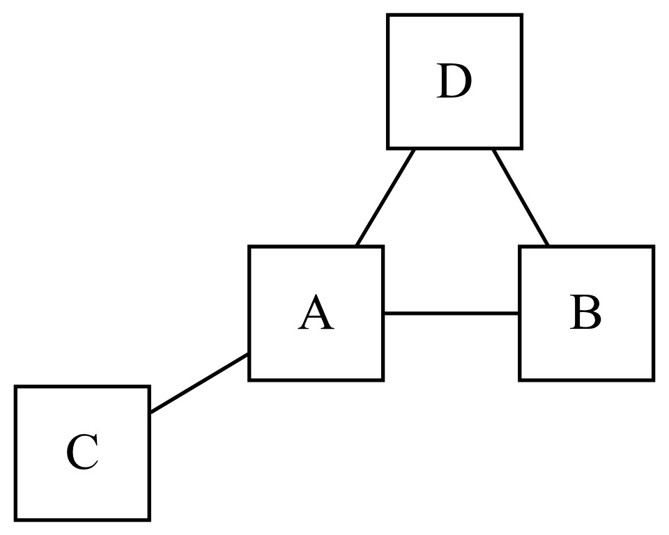
In consideration of the graph in Figure 1, the central node is along the shortest path between any other two nodes in the graph. In the graph in Figure 2, node 1 is “between” nodes 2 and 5 but not nodes 3 and 4. Node 5 is not “between” nodes 2 and 7 in this sense because even though a path between nodes 2 and 7 may go through node 5, the shortest path does not.
2.3.3. Closeness centrality
Closeness is a measure of how close each other node is to a given node in a network. The formula for (normalized) closeness centrality of a node is given by
C(a)=N−1∑b≠ad(a,b),
where is the number of nodes in the graph and is the distance between node and For example, in Figure 2, there are nodes in the graph. We also have and and so forth. Consequently, the closeness centrality measure for node 1 is equal to
2.3.4. Eigenvector centrality
Eigenvector centrality is defined as the principal eigenvector of the adjacency matrix and is defined by the following formula:
λv=Av,
where is the eigenvalue, is the eigenvector, and is the adjacency matrix representing the graph structure. Eigenvector centrality reflects the degree of “influence” a node has in a graph structure. For example, in modeling the spread of a pandemic, if person A has contact only with person B, they may still have a high degree of influence in the network if person B has contact with many others.
2.3.5. PageRank
PageRank is the algorithm famously relied on by the Google search engine and described in Page et al. (1999). The algorithm ranks the relative importance of nodes in a graph based on the number of links to each node. Although designed with digraphs in mind (in consideration of website links), the algorithm applies to both directed and nondirected graphs.
The algorithm determines the relative importance of a node iteratively until nodes converge to stable rank. A simple example illustrates this process. Consider a graph consisting of four nodes connected as shown in Figure 3.
To determine PageRank, each node in the graph begins with an initial PageRank, typically for nodes in a graph. In each iteration of the algorithm, each node’s PageRank is updated based on the PageRank of the connected nodes as
PageRanki(A)=PRi(A)=1−dN+d(∑v∈BAPRi−1(v)L(v)),
where the subscript refers to the iteration of the algorithm, is a “damping factor,” is a node in the collection of nodes that are connected to and is the number of total connected nodes to which is connected.
Therefore, assuming each node has a beginning PageRank of and using a damping factor of calculating the PageRank of node A in Figure 3, for the first iteration, gives
PR1(A)=1−dN+d(PR0(B)2+PR0(C)1+PR0(D)2)=1−0.84+0.8(0.252+0.251+0.252)=0.45.
The PageRank for nodes B, C, and D are likewise updated based on the PageRank for connected nodes. This process continues with subsequent iterations until the PageRank at each node converges to a stable value.
2.4. GNNs
Finally, having discussed many important concepts in graph theory, we turn our attention to GNNs. GNNs are prediction models that rely on graph data. GNNs can be used for multiple kinds of prediction tasks, including making predictions at the level of individual nodes (based on information from elsewhere in the graph), predictions about the links between nodes, and predictions based on the entire graph structure.
In general, territorial ratemaking applications of GNNs will tend to focus on node-level predictions, i.e., predictions regarding the relative risk at each node (which may be a zip code, county, census tract, or grid cell). However, GNNs may have many relevant applications that deal with edge- or graph-level predictions. As an example, a setup similar to Parodi and Watson’s (2019) could rely on graph-level predictions to estimate fire damage at a property. It is possible to imagine a graph of connected electronic devices with node-level information being used to predict cyber risk to a network. Node- and edge-level predictions could be used to model risk at specific locations and the likelihood of spread of wildfire or risk at wildland-urban interfaces.
At a high level, GNNs take in graph data (i.e., a set of nodes with particular values, along with their connections to other nodes) and learn a representation of the graph structure. These representations are “embeddings.” A node-level embedding is a representation of graph structure relative to each node in the graph. It contains information about the local graph structure, including all connected nodes, their relative values, and the nodes connected to those nodes.
The way these embeddings are learned is through “message passing.” Message passing is a generalization of convolution. Consider again the Euclidean graph structure described above. A convolutional layer might average the observations in a moving frame of nine adjacent grid cells. In this way, each group of nine connected nodes “shares information” in that the convolutional layer depends on the values in each cell. In GNN message passing, by contrast, each layer shares information only among adjacent connected nodes in the graph structure.
Consider a single node (such as a zip code), which we will call “node A,” along with its connections (e.g., adjacent zip codes) and the values associated with each node (pure premiums in each zip code). Following this input layer, the first embedding layer of the GNN passes information from adjacent nodes. So for the first embedding layer, the embedding for node A is calculated based on the pure premium at node A as well as the pure premium for all of its immediately connected neighbors. Therefore, the first node-level embedding for node A includes some immediately local information about the structure of the graph (connections) and the values in the neighborhood of node A.
Following this, there may be a second embedding layer. Like the first embedding layer, the second node-level embedding is based on a weighted combination of that node-level embedding and the adjacent node-level embeddings. The second embedding for node A is therefore calculated based on the embeddings for node A and the embeddings for its adjacent nodes. Note that in the first embedding layer, each of the neighbors of node A also learned information about its neighbors. Consequently, in the second embedding layer, when the embedding at node A is passed information from its neighbor embeddings, it gains some information about the neighbors of its neighbors.
The number and size of node-embedding layers are hyperparameters of the model. In general, it is desirable to learn some information about local graph structure at each node-level embedding; however, too many embedding layers would result in oversmoothing the graph. For instance, the value at node A may be informed by information about node A’s neighbors and its neighbors’ neighbors, but there is a limit beyond which local information is too diluted by considering very distant nodes that do not have much impact on node A.
In this study, we employ an edge-conditioned message-passing formulation in which edge attributes parameterize the weight matrices used in neighborhood aggregation, allowing richer modeling of territorial interactions than fixed-weight convolutional approaches.
3. Data
Belgian motor third-party liability insurance data (beMTPL97) from the CASDatasets R package (Dutang and Charpentier 2024) were used for this study. This dataset was chosen as it was open source and had available georeferenced data, making it possible to relate loss costs to territories.
The dataset comprises 162,231 observations of 17 variables. Of these, four represent geolocation (postal code, town, latitude, and longitude). Four variables are continuous (policyholder age, bonus-malus, car age, and horsepower), and five are categorical (coverage, fuel, use, fleet, and sex). Number of claims and total amount of claims were provided, along with exposure as a fraction of the year during which the policy was in force.
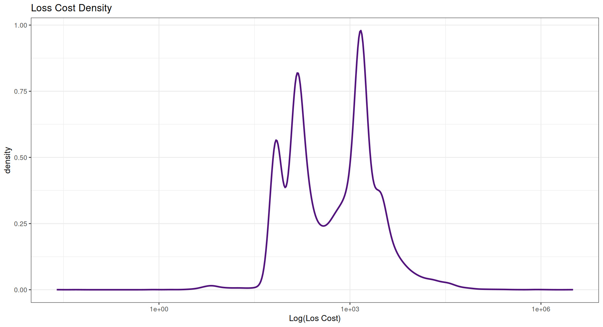
Log loss costs (Figure 4) in the data are multimodal.

For the purposes of this study, loss costs were modeled based on a variety of territorial variables—province, latitude and longitude, graph features, etc.—rather than as a function of the nonterritorial variables.
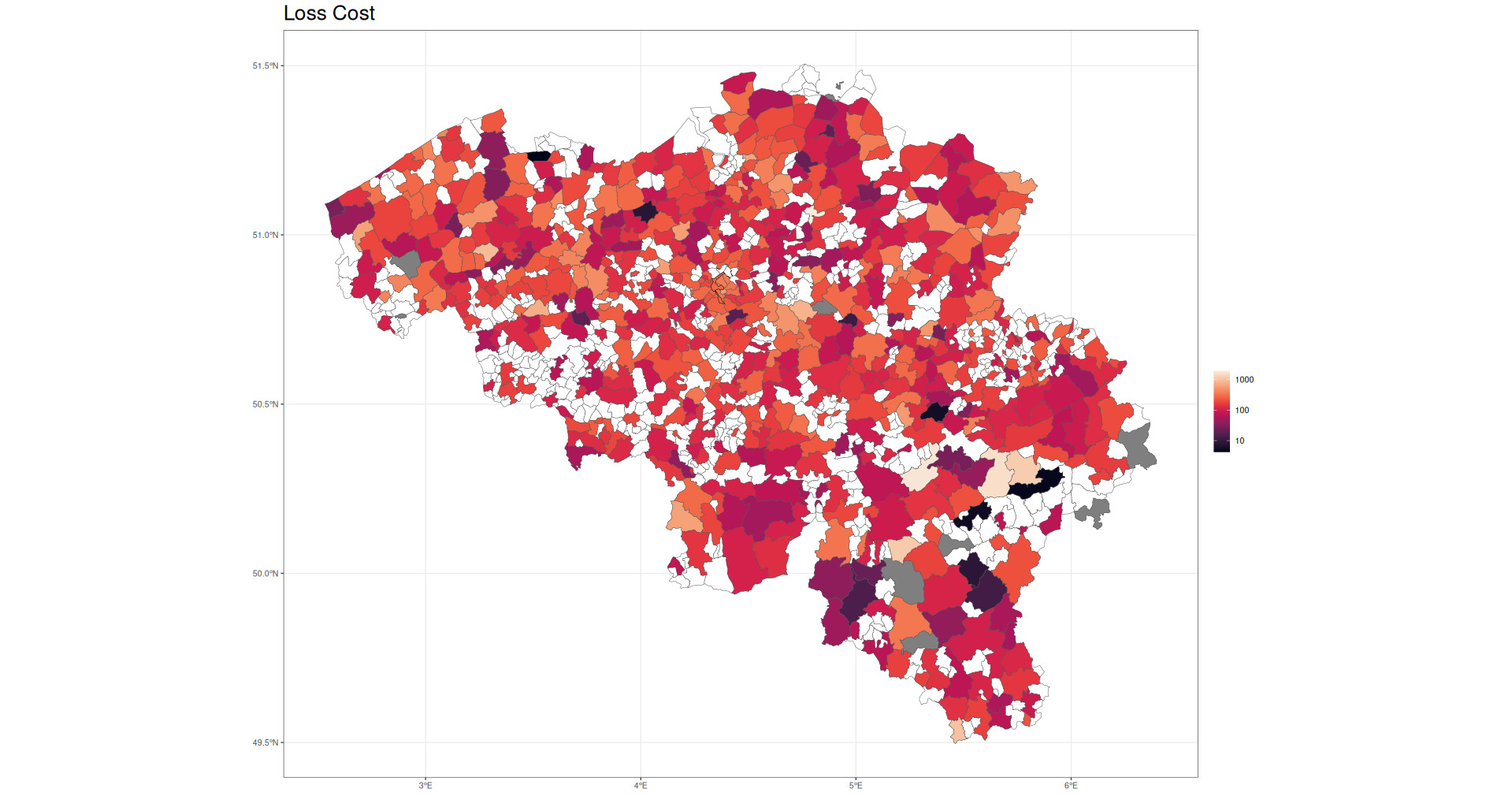
Figure 5 shows raw loss costs as a function of Belgian postal code.

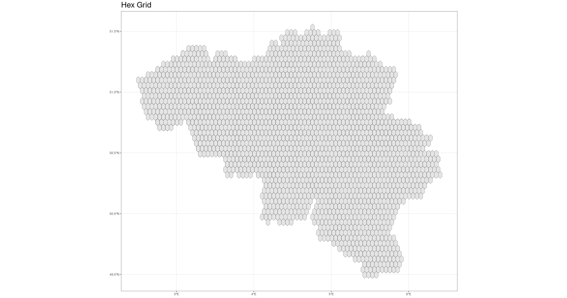
While this paper makes use of postal code–level data, it should be noted that in some circumstances, postal codes may not be available or are not useful representations of risk due to the size and shape of the territories. In those circumstances, it may be useful instead to simply define graph relations over a hex grid covering the territory in question. In this case, this would give something like the map in Figure 6.
Note that for applications involving larger or differently structured data (e.g., the United States or Canada), few changes are required to ensure that the proposed models work appropriately. However, it may be reasonable to determine clusters according to different methodologies, such as hierarchically (reflecting political divisions) or based on known geographic boundaries (mountains or rivers, for instance). That being said, very small subregions in a large geographic area could generate a higher degree of computational complexity. In these situations, it may be necessary to cluster more aggressively or use other techniques to simplify the graph structure where it makes sense to do so.
The specific representation of geographic data employed may be based on the line of business in question or on available data. For example, risk from weather events may be more evenly distributed geographically, so political boundaries may not make as much sense. Instead, hex grids would more evenly encode differences across geographic regions, though physical barriers may also play a role. Auto risk, by contrast, may be more related to locations and connectedness of major cities, so political boundaries may be more relevant. Theft risk may differ at the neighborhood level; this could be roughly measured by census blocks, which could be hierarchically clustered into census block groups and census tracts, providing risk information at multiple geographic levels simultaneously. Therefore, consideration should be given to the way that risk varies geographically.
3.1. Edge and node encodings
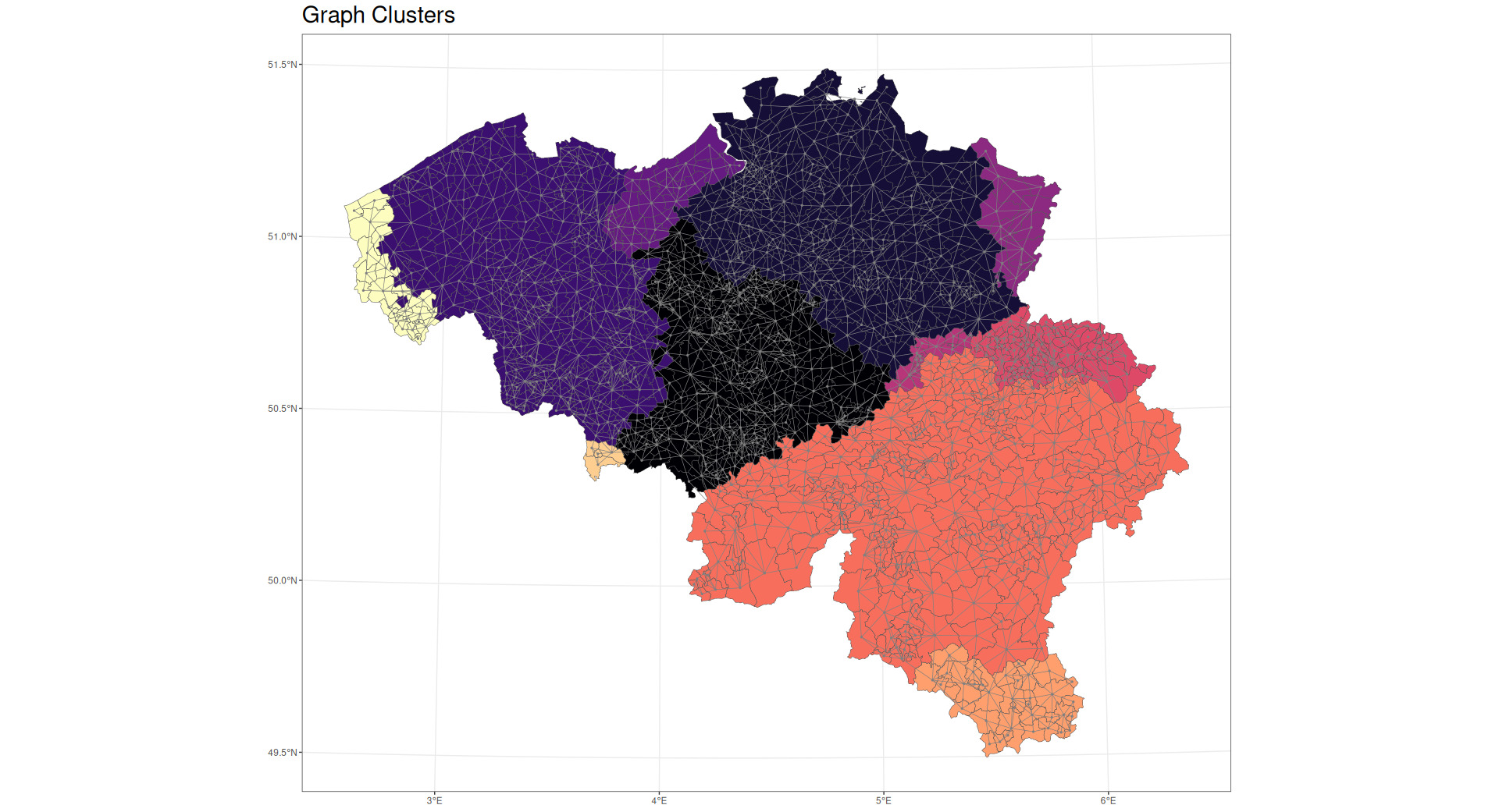
As discussed earlier, nodes, edges, and graphs can encode different types of information. In this paper, no graph-level features are employed. Nodes are identified with Belgian postal codes. Node-level features include the node centrality measures previously discussed as well as densest community membership (as shown in Figure 7), centroid latitude and longitude, perimeter, and area. Edge-level features include distance between centroids of adjacent nodes, edge centrality, and the length of shared borders between adjacent nodes.

In practice, more complex sets of features are generally available and may improve predictions. Node-level information could include standard geodemographic data about each node (e.g., population density, prevailing weather patterns) as well as typical node-level information such as average loss cost or average insured value. Edge-level information could include commonly overlooked but highly relevant information such as travel time, number of major highways, connectedness by rail, and presence of major physical barriers such as rivers or mountains. Edge-level features could also be defined as the differences of adjacent node-level values such as the difference in population density.
Including this additional information may enable the model to more accurately predict node-level risk and the extent to which adjacent nodes are expected to have similar or dissimilar risk levels. For example, node-level information may predict that a densely populated area may have higher risk (all else equal) than a sparsely populated area, while edge-level information may predict that closely connected areas may have more similar risk (all else equal) than areas that have few roads connecting them or that are far apart. Using the relative strength of these relationships, the model could then predict the relative risk of a densely populated area that is closely connected to a sparsely populated area.
In general, as it pertains to the models in this paper, node-level information may be thought of as relating to the base risk level at each postal code, while edge-level information may be thought of as relating to the expected similarity or dissimilarity between adjacent postal codes.
4. Proposed models
This paper compares five methods of capturing territorial signal. Models 1 through 4 are GLMs or generalized additive models (GAMs) (Hastie and Tibshirani 1986) that use Tweedie distributions and log-link functions with exposure as an offset. The fifth model is a GNN. All models include pure premium as the target variable, where pure premium is defined as the total loss amount for each policy divided by the total exposure.
A description of the five models follows.
4.1. Model 1: Province model
The first model uses just location information to divide Belgium into 11 provinces. Loss cost is therefore a simple function of province, which is categorical. Model 1 is defined by the following linear predictor:
log(E[Losscost])=β0+β1Province1+...+β10Province10,
where
-
is the model intercept and
-
through are coefficients for provinces other than the “base” province.
4.2. Model 2: Geographic spline model
The second model uses a thin plate spline function of latitude and longitude. This spline function, described in Wood (2003), might be thought of as a two-dimensional analog of a standard cubic smoothing spline. It provides a smooth function of two dimensions, allowing for smooth variation in loss costs across geographic regions. This model represents territorial relativities based on a complex function of latitude and longitude but without reflecting any aspect of the graph structure of the territories in question.
Model 2 is defined by the following linear predictor:
log(E[losscost])=β0+s(X,Y),
where
-
is the model intercept and
-
is the thin plate spline function of and (longitude and latitude) that models the geographical component.
4.3. Model 3: Graph features
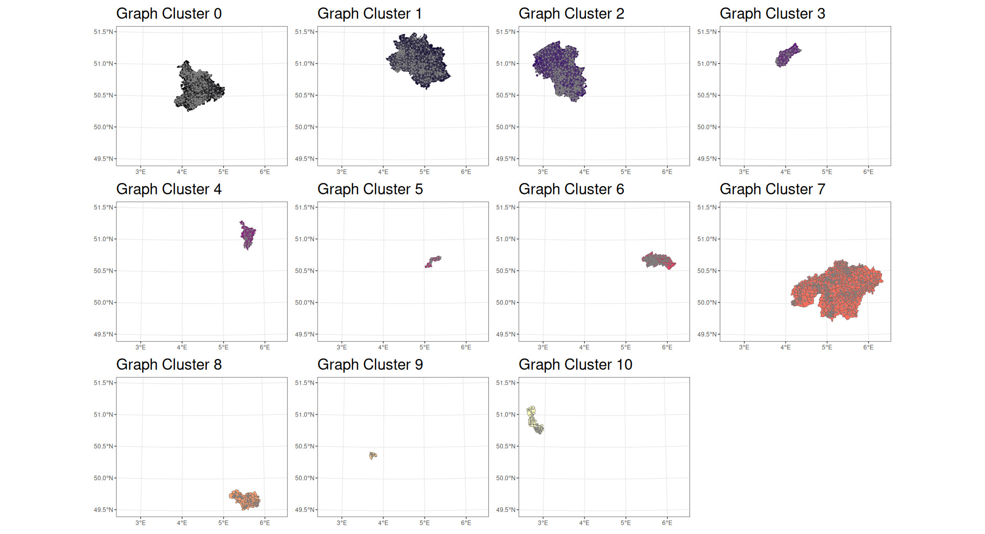
The third model relies on variables for several aspects of the graph structure of the data. This includes variables representing degree centrality, betweenness centrality, closeness centrality, eigenvector centrality, and PageRank in addition to a cluster assignment based on identifying dense subgraphs.
A dense subgraph, often described as a “community,” is defined as a subgraph with many edges per vertex. Dense subgraphs may be used to identify appropriate clusters based on the hierarchical agglomeration algorithm approach described by Clauset et al. (2004). This is a “greedy” algorithm that attempts to identify territorial clusterings that optimize a property known as “modularity.” Modularity is optimal when there are many connections within the identified subgraphs and few connections between them. As an example, within a city, there are many roads connecting one building to another, but between cities there are far fewer roads—perhaps only a small number of larger highways.
The algorithm employed was able to find 10 communities within the dataset. An example of a community in a graph is shown in Figure 7.
Figures 8 and 9 show the densest communities identified in the data being analyzed.

By modeling multiple measures of centrality as well as dense subgraph clusters, Model 3 is able to determine loss cost based on the graph structure relation between territories. That is, Model 3 captures some aspects of shared risk arising from the way that territories are connected to one another.
Model 3 is defined by the following linear predictor:
log(E[losscost])=β0+m∑j=1γjgj,
where
-
is the model intercept,
-
are the model coefficients, and
-
are the graph features, including centrality measures and cluster membership.
4.4. Models 4 and 5: GNN embeddings and predictions
The fourth and fifth models use variables or results derived from a GNN. The implemented GNN follows a message-passing neural network (MPNN) architecture using NNConv (edge-conditioned convolution) layers from PyTorch Geometric. The GNN predicts the pure premium at each node (Belgian postal code), optimized with a Tweedie loss function.
Unlike standard graph convolutional network layers that assume fixed aggregation weights based solely on graph structure, NNConv layers learn edge-conditioned weight matrices as functions of edge attributes. This allows the model to directly incorporate border length, centroid distance, and edge betweenness centrality into the message-passing mechanism.
The network contains three NNConv message passing layers of increasing dimensionality (32, 64, and 128 hidden units), each followed by batch normalization, leaky ReLU activation, dropout, and residual connections. These layers are followed by three fully connected feed-forward layers that produce the final node-level pure premium predictions.
A summary of the model is given in Table 1.
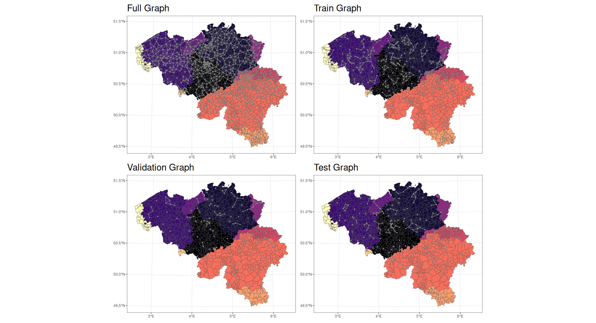
The network uses the graph induced from the map and the observed pure premiums at each postal code. In addition, the data have been augmented with features such as the area and perimeter of each postal code alongside additional edges between the vertices belonging to the same cluster previously identified. For the purpose of fitting the model, graph data were split into training, validation, and test datasets in Figure 10.
The network was fit using at most 500 epochs, with early stopping if improvement is not seen in at least 10 epochs.
The fourth model makes use of embeddings from the neural network, specifically the output of the third NNConv layer after batch normalization ((bn3)BatchNorm in Table 1). These embeddings represent 128-dimensional learned node representations that encode multihop structural information, node-level attributes, and edge-conditioned interactions derived through the message-passing procedure.
These embedding layers can be interpreted as numerical encodings of complex territorial relationships discovered by the NNConv-based MPNN during training. By including these embeddings (reprojected to eight dimensions via t-distributed stochastic neighbor embedding [t-SNE]) as covariates within a GAM framework, the model is able to leverage graph-learned structure while retaining interpretability within a semiparametric regression setting.
Model 4 is defined by the following linear predictor:
log(E[losscost])=β0+8∑k=1δkek,
where
-
is the model intercept,
-
are the model coefficients, and
-
are the embeddings from the GNN.
Model 5 uses predictions directly from the GNN and does not have a GAM or GLM structure, i.e., the output of the layer (fnn3)Linear in Table 1.
5. Results
In this section, we compare the results achieved by the models previously described. Each model is evaluated according to standard actuarial metrics (Goldburd et al. 2016). Statistics and measures used for model comparison include the following:
-
Root-mean-squared error (RMSE)
-
Mean absolute error (MAE)
-
Symmetric mean absolute percentage error (SMAPE)
-
Jensen-Shannon divergence (J-S divergence)
-
Gini coefficient
-
Moran’s I
-
Choropleth maps showing how each model captures spatial effects
RMSE, MAE, and Gini coefficients are relatively common within actuarial science. SMAPE is a measure of the percentage difference between the prediction and the actual loss cost given by the following formula:
SMAPE=1n∑|A−P||A|+|P|,
where
-
is the actual loss cost and
-
is the predicted loss cost.
Therefore, a low value for SMAPE indicates a close alignment between the actual and predicted values. Because the denominator is the sum of the absolute values of the actual and predicted, this metric generally avoids the issue of having a denominator of zero.
J-S divergence is a metric similar to the more familiar Kullback-Leibler divergence (K-L divergence) but is symmetric. Similar to the K-L divergence, the J-S divergence measures the degree of difference between two probability distributions. The formula for J-S divergence is given by
JSD(P||Q)=12D(P||M)+12D(Q||M),
where
-
and are the probability distributions in question,
-
-
is the K-L divergence function.
Correspondingly, a low J-S divergence indicates that two distributions are very similar.
Finally, Moran’s I is a measure of spatial autocorrelation. One way to think about this is the extent to which a loss cost in a given location is correlated with the loss costs in adjacent locations. It is described further in Moran (1950). In this paper, Moran’s I is measured on residual loss costs by territory.
All the metrics shown are evaluated on the test set, i.e., the held-out observation that did not contribute to the training of the models.
5.1. Model performance comparison
5.1.1. Overall predictive power.
Table 2 shows the results of the comparative tests described above.
Model 4 (embeddings model) appears to have superior performance on MAE, SMAPE, and J-S divergence. Model 1 (provinces model) has the lowest RMSE. Interestingly, the Gini index of Model 5 (GNN model) is vastly superior to any alternative in spite of having worse performance on the other tests.
This behavior appears to be related to how each model treats claims of differing sizes and therefore may be partly related to how the model is fitted.
5.1.2. High-risk identification (90th percentile)
Figure 11 presents the relative SMAPE for each model as a function of claim size. This graph illustrates how well each model predicts higher-risk exposures.
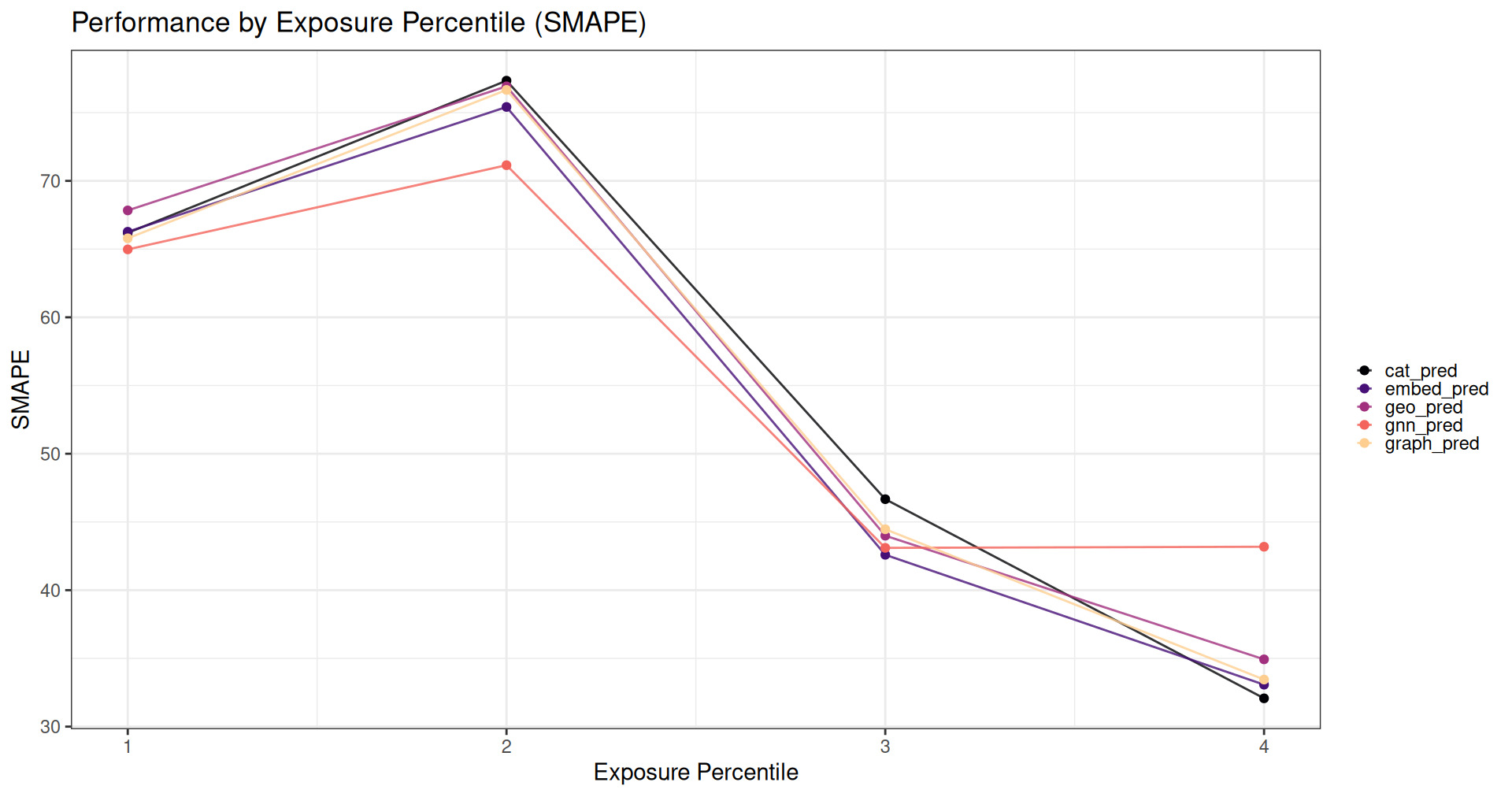
The GNN model has considerably superior performance at predicting losses when the claim sizes are small or medium but has worse performance for very large claims. Large claims disproportionately affecting RMSE may explain why Model 5 appears to have worse performance by that metric while significantly outperforming all other models with respect to Gini index.
5.1.3. Spatial effects
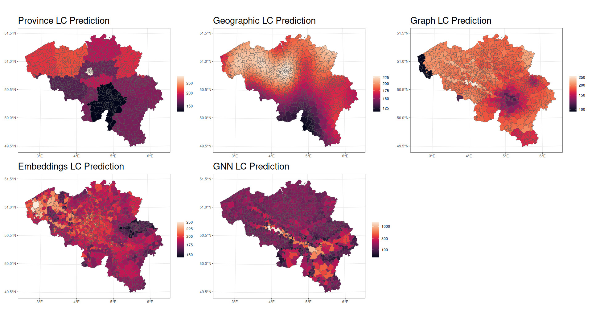
Figure 12 displays choropleth maps for the Loss Cost (LC) for each model. This visualization helps one understand how each model differs in its representation of geographical risk.

The province model (Model 1) shows pronounced variations in risk by province, with distinct low-risk areas (darker regions) in the southwest (Namur) and high-risk areas (lighter regions) in the northwest of Belgium (Flanders) and in the middle (Brussels). While this model is very basic in its representation of geographic risk, it gives an initial view of how risk is distributed throughout the country.
The geographic spline model (Model 2) produces a smoother spatial effect with less extreme local variations. The low-risk area in the southwest of the country is smoothed considerably, and lower-risk regions in the north are reduced in size considerably.
The graph features model (Model 3) is strikingly different from the spline and province models and suggests a very different view of the spread of risk. It still concentrates a lower-risk area in the southern part of the country but adds a very low-risk area in the extreme northwest of the country. This low-risk area is implied in the corner of the geographic spline model, while the graph features model separates West Flanders into a very low-risk area and a moderate-risk area. An area southwest of Brussels receives the highest risk, while much of the risk has been distributed relatively evenly throughout the country.
The embed model (Model 4) is characterized by greater differences among adjoining postal codes. This model shows a distinct risk pattern, with high-risk areas in the northeast and central part of the country and lower-risk areas in the west. In the same vein as the graph features model, the embeddings in the embed model appear to explain some local variation in risk but in different areas from the graph features model.
The GNN model (Model 5) produces spatial effects that seem to blend aspects of the graph features model and the embed model, capturing both the overall pattern and many local variations. Notably, the GNN model has the greatest scale; the highest-risk areas predicted by the GNN model are considerably higher risk than those predicted in other models. The GNN model therefore seems able to have greater ability to distinguish very fine differences in risk across postal codes.
5.1.4. Spatial autocorrelation
Moran’s I for the residuals of each of the models are shown in Table 3.
Model 2 residuals have the lowest spatial autocorrelation, while Model 4 and 5 residuals have the highest. There are several ways to interpret this finding. In the absence of other data, this would seem to imply that Model 2 does the best job of capturing local effects in an unbiased way, while Model 5 appears to have uncaptured signal. However, given the significant superiority of Model 5 in terms of Gini index, this seems to be incorrect because Model 5 is clearly doing a superior job of ranking the relative riskiness of territories.
Two other possibilities present themselves. First, Model 5 residuals may have higher spatial autocorrelation for the same reason that Model 5 has higher RMSE. Because Moran’s I is calculated in part based on distance from mean, the Moran’s I value may be distorted by Model 5’s underprediction on the highest quantiles of risk. Alternatively, it is possible that Model 5 is capturing more of the geography-based risks and inadvertently revealing spatial correlation between nongeographic variables and geography.
5.1.5. Feature importance
Figure 13 shows the permutation variable importance plots of features included in the GNN model.
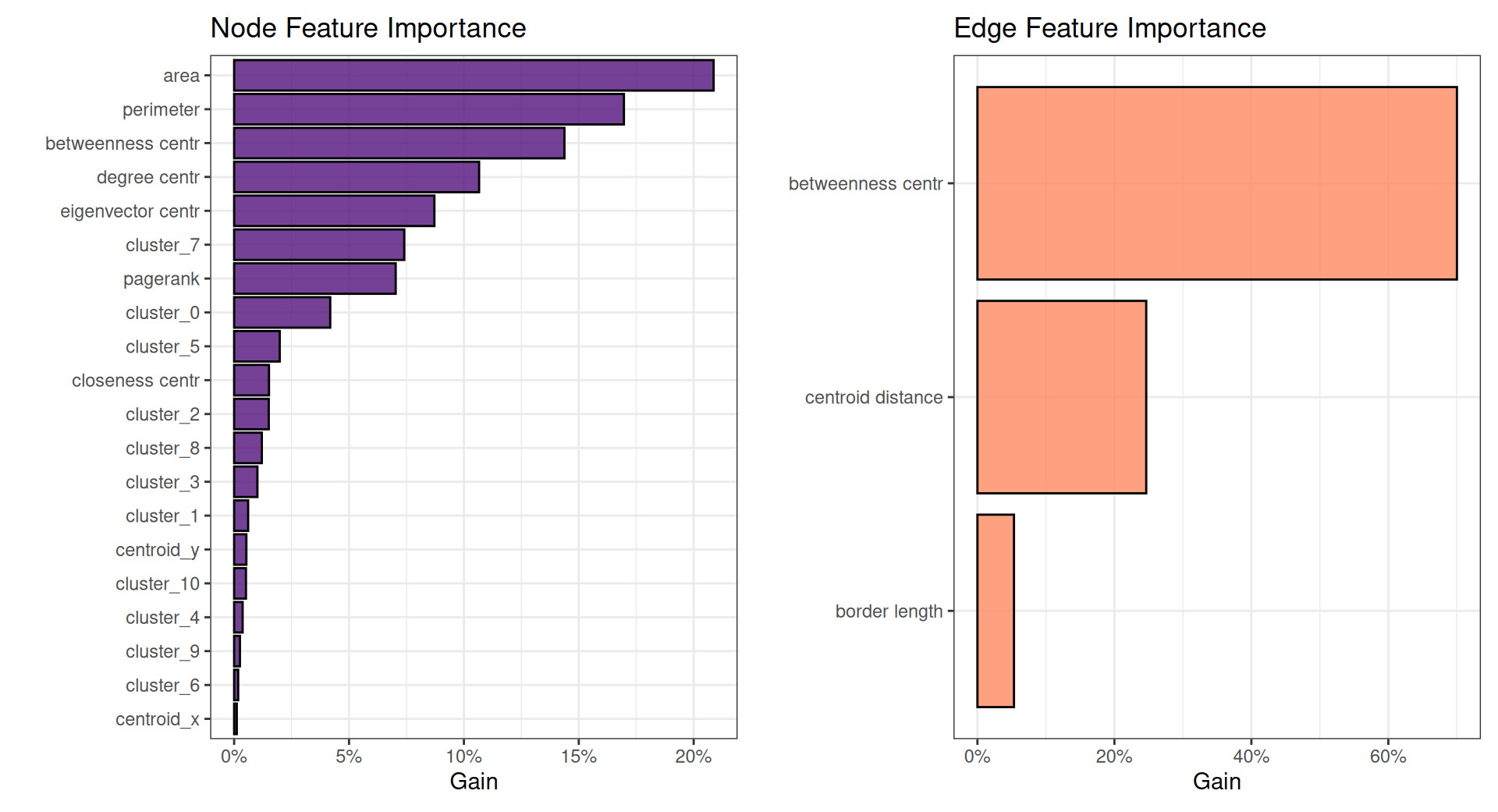
Note that the left plot in Figure 13 shows node-level features and the right plot shows edge-level features.
Most notably, geographic risk models often assess regional variation in risk on the basis of distance between centroids. For example, two adjacent zip codes may be considered more similar in risk than two distant zip codes, and oftentimes rate relativities are credibility-weighted on the basis of distance. The edge feature importance plot on the right shows that centroid distance takes a distant second place to betweenness centrality in this model. Similarly, many graph features rank very highly in node feature importance. This appears to indicate that these often-overlooked features may be considerably more valuable for prediction than more commonly used features.
5.2. Comparative analysis
While the province model (Model 1) has slightly superior RMSE, the embed and GNN models (Models 4 and 5) appear to considerably outperform the province model in most other respects, with the GNN in particular showing a considerably superior Gini index compared to any other model, indicating substantially better ranking of relative risks. The GNN model outperforms other models in predicting small and medium risks, the graph model outperforms on larger risks, and the embed model shows superior performance on the largest risks. Interestingly, the geographic spline model does not outperform on any test in this dataset. This seems to indicate that differences in risk across postal code are not well modeled by latitude and longitude alone but that connectedness and centrality play an important role in determining the geographic spread of risk. This is supported by the feature importance plot from the GNN model, which demonstrates that centroid distance is of secondary importance.
5.3. t-SNE clusters
The t-SNE (Maaten and Hinton 2008) technique offers an additional perspective for visualizing high-dimensional data in a lower-dimensional space, typically two or three dimensions, while preserving local relationships. This technique is particularly valuable for understanding the latent structure captured by our graph-based models, especially the embeddings generated by the GNN. When applied to the 128-dimensional embeddings produced by the GNN (the output of the layer (bn3)BatchNorm in Table 1), t-SNE reveals distinct clusters of postal codes that share similar risk characteristics. Figure 14 illustrates these clusters, wherein each point represents a postal code that is colored according to its observed loss cost.
It is very interesting that these clusters resemble the densest communities found with traditional Network analysis techniques (Model 2). Note that coloration in Figure 14 represents the densest community clusters, while red circles represent t-SNE clusters.
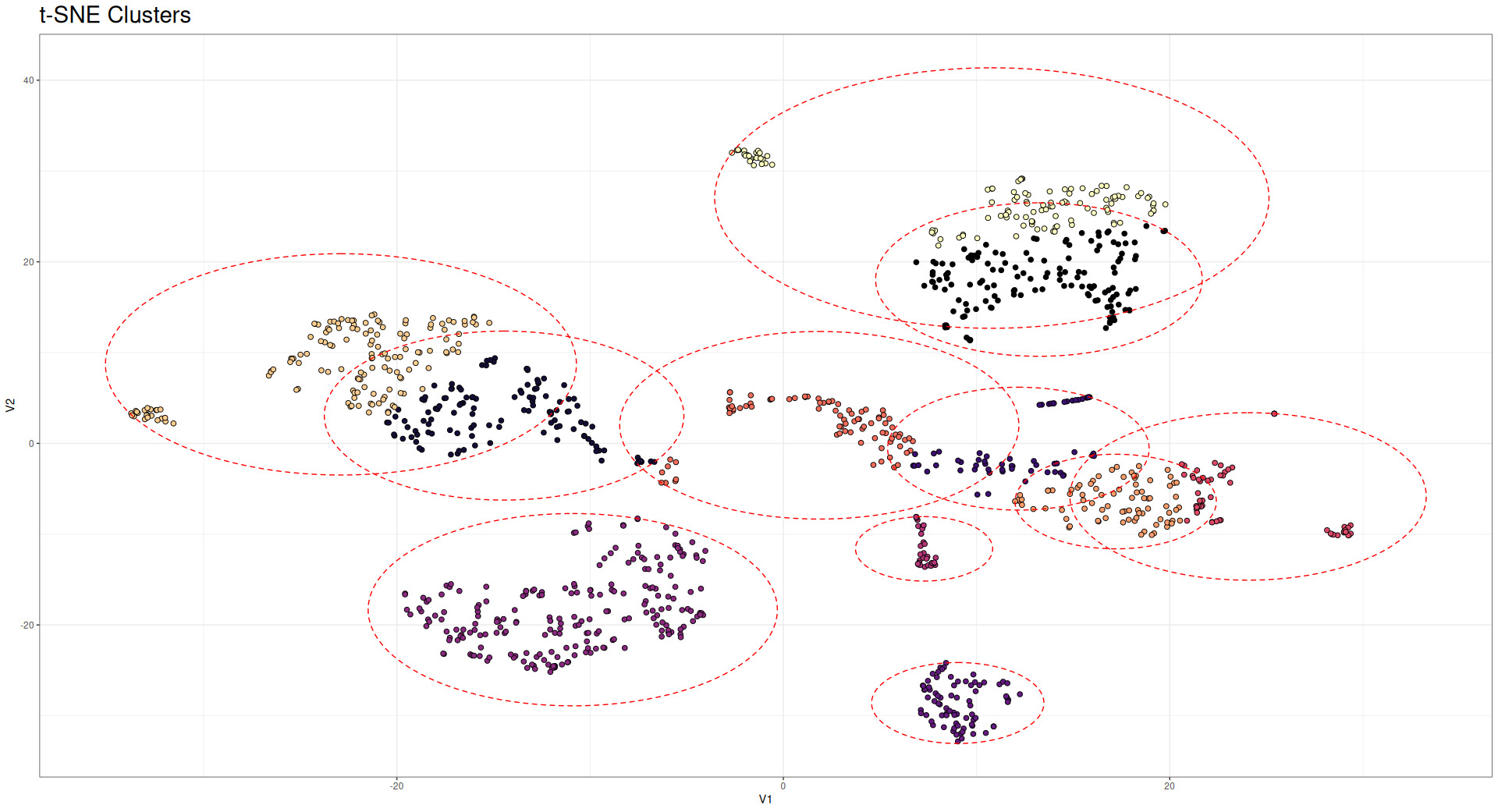
The t-SNE visualization complements our previous analyses by revealing structure in the embedding space that is not immediately apparent from geographical representations. While geographical proximity often correlates with similar risk profiles, the t-SNE clusters demonstrate that the GNN has captured additional dimensions of similarity that transcend pure spatial relationships. Furthermore, this analysis demonstrates the effectiveness of the GNN, which is able to mirror (and in some instances, produce better results than) network analysis techniques. Actuaries potentially could use these embeddings to define new territory boundaries that more accurately reflect homogeneous risk groups, fully leveraging all the information provided by the GNN.
5.4. Computational effort
The implementation of graph-based methods for territorial ratemaking necessarily involves considerations of computational resources and efficiency. This section compares the computational efforts of all the models evaluated in this study considering time, computational power, and data preparation effort.
5.4.1. Training time and resources
Table 4 presents the computational resources required for training each model, including training time, memory usage, and additional preprocessing requirements.
As expected, the provinces model (Model 1) demonstrates the lowest computational demands, requiring only basic GAM fitting over latitude and longitude coordinates. In contrast, the graph-based models are the most demanding in terms of time, computational power, and data manipulation effort.
It is possible, however, to adopt several optimization techniques to reduce computational time and resources:
-
Graph representation: Adjacency matrices can be stored in sparse format, reducing memory requirements for large graphs.
-
GNN batched training: The GNN models can be trained using mini-batch gradient descent, which reduces memory usage.
-
Early stopping: Neural network training can be terminated early, preventing unnecessary computation.
-
Parallel computation: All the calculations can be parallelized, reducing computational time.
6. Conclusion
This paper has introduced and evaluated novel approaches to territorial ratemaking using graph theory and GNNs. By representing territories as nodes in a graph, we have demonstrated how graph-based methodologies and GNN can capture complex spatial dependencies that go beyond pure geographic differences.
6.1. Key findings
Our comparative analysis of five territorial ratemaking models yields several important insights:
-
Differing discriminatory power: The GNN model achieved considerably higher Gini index than any other model, indicating superior ability to discriminate among risks.
-
Local variation: Graph-based models (particularly Models 4 and 5) appear better able to capture local differences in risk that are averaged out in simpler models (such as Models 1 and 2). The extent of these local differences could be reduced in Model 5 by additional convolutional/message-passing layers if desired.
-
Latent structure discovery: The t-SNE visualization of GNN embeddings reveals clusters of territories with similar risk profiles that are not immediately apparent from geographical representations alone. These clusters suggest alternative territory groupings that could potentially improve rating efficiency.
-
Computational trade-offs: While the GNN-based approaches demand significantly greater computational resources during training, their inference times remain practical for operational deployment. This suggests that these methods are viable for real-world insurance applications, particularly with periodic model retraining.
-
Graph features importance: The variable importance plot of Model 5 demonstrates that graph-based measures can be highly relevant to prediction of geographic risk.
6.2. Practical implications
For actuaries and insurance professionals, our findings suggest several practical applications:
-
Territory definition: GNN embeddings could inform the design of new territory boundaries that better reflect homogeneous risk groups, potentially replacing traditional postal code or county-based territories with more risk-coherent regions.
-
Credibility enhancement: By leveraging the graphical relationships between territories, these methods effectively borrow strength from adjacent and similar regions, potentially improving credibility for territories with sparse data.
-
Gradient smoothing: The more cohesive spatial effects produced by graph-based models naturally create smoother transitions between territories, addressing the “border problem” where adjacent properties on opposite sides of a territorial boundary receive drastically different rates.
-
Feature engineering: The centrality measures and community detection algorithms demonstrated in this paper can be incorporated into traditional GLM approaches, offering a middle ground between pure geographical models and complex neural networks.
6.3. Limitations and future research
While our results demonstrate the potential of graph-based approaches, several limitations warrant further investigation:
-
Graph construction: The performance of graph-based models depends critically on how a graph is constructed. Future research should explore optimal methods for defining edges and edge weights between territories. For example, a graph may be constructed to consider only adjacency relationships, or it may be constructed so that communities are fully connected. This paper does not explore potential algorithmic approaches to identifying optimal graph designs.
-
Temporal dynamics: This study focused on static graph representations. Extending these methods to accommodate temporal changes in territorial risk patterns represents a promising direction for future work.
-
Interpretability challenges: While GNN embeddings capture complex relationships effectively, their high dimensionality and nonlinear nature present challenges for interpretation. Developing tools to better understand what these embeddings represent would enhance their practical utility.
-
Model uncertainty: Quantifying uncertainty in graph-based predictions remains challenging. Future research should address how to develop confidence intervals or credibility measures for territorial relativities derived from these approaches.
-
Additional graph architectures: This paper employed an MPNN architecture using NNConv (edge-conditioned convolution) layers implemented in PyTorch Geometric. Future work could explore alternative GNN architectures such as graph attention networks, GraphSAGE, or spectral graph convolutional network variants, which may capture different aspects of territorial interaction dynamics.
6.4. Concluding remarks
Graph theory provides a natural framework for modeling territorial relationships in insurance ratemaking. By representing territories as nodes in a graph and leveraging the rich mathematical tool kit of graph theory, actuaries can capture complex spatial dependencies that traditional approaches may miss.
In particular, the use of edge-conditioned NNConv layers allows the model to learn how specific territorial relationships (such as shared border length or connectivity strength) influence risk propagation across the graph, extending beyond traditional distance-based smoothing approaches.
The methods presented in this paper complement rather than replace traditional territorial ratemaking approaches. They offer additional tools for actuaries to understand and model spatial risk variations, particularly in complex environments where simple geographical proximity may not fully explain risk differences.
As computational resources continue to become more accessible and graph neural network methodologies mature, we anticipate that graph-based approaches will play an increasingly important role in the actuarial tool kit, enabling more sophisticated and accurate territorial ratemaking models that better serve both insurers and policyholders.
Acknowledgments and disclaimer
This work was sponsored by the Casualty Actuarial Society and the Society of Actuaries Research Institute’s Committee on Knowledge Extension Research. The authors wish to give a special thanks to all the Casualty Actuarial Society staff who supported the ongoing research and to the anonymous reviewers who provided extremely useful insights that significantly improved the quality of our paper.
Finally, the opinions expressed in this paper are solely those of the authors. Their employers neither guarantee the accuracy and reliability of the contents provided herein nor take a position on them.
Code and data availability
All code required to reproduce the results, tables, and figures reported in this manuscript is publicly available at the following repository:
Repository URL: https://github.com/marcopark90/GraphRatemaking
Instructions for reproducing the main results are provided in the repository README.
Repository contents
The repository provides a complete end-to-end pipeline for territorial ratemaking using the methods presented.
Specifically, the repository includes the following:
-
Data preprocessing:
-
Loading and processing of the Belgian Motor Third Party Liability dataset from the CASDatasets R package
-
Creation of train/validation/test splits
-
Integration of spatial data (shapefiles) with claims data
-
-
Graph construction:
-
Spatial adjacency graph construction from postal code boundaries
-
Computation of node features: centrality measures (degree, closeness, betweenness, eigenvector, PageRank), spatial attributes (centroid coordinates, area, perimeter), and community clusters
-
Computation of edge features: border length, centroid distance, edge betweenness centrality
-
-
Models training:
-
Python: GNN implementation using an MPNN architecture with NNConv (edge-conditioned convolution) layers from PyTorch Geometric, including learned edge networks, residual connections, batch normalization, dropout regularization, Tweedie loss optimization, early stopping, and permutation-based feature importance analysis.
-
R: Fitting of four GAM models (categorical province model, geographic spline model, graph features model, embedding model)
-
-
Model evaluation:
- Comprehensive evaluation metrics: RMSE, MAE, SMAPE, J-S divergence, Gini coefficient, quantile loss, Moran’s I spatial autocorrelation, and custom actuarial metrics
-
Visualization and figure generation:
-
Graph visualizations (clusters, train/test splits, community detection)
-
Spatial effect visualizations
-
Prediction maps for all five models
All figures referenced in the manuscript are generated by these scripts.
-
-
Table generation: All tables in the manuscript (including model performance metrics and computational resource requirements) are generated programmatically within the R analysis scripts.
Data availability
The empirical dataset used in this study (beMTPL97) is publicly available via the CASDatasets R package (Dutang and Charpentier 2024).
Graph-level features typically become more important in a context in which there are multiple graphs that may be classified or regressed against. For example, although the foregoing discussion proposes nodes and edges to represent territories and the relationships between them, it would be possible to model individual policyholders abstractly as graphs, whereby graph-level predictions represent predictions about policyholders. In a more familiar context, given geolocation data about where an individual generally drives, it would be possible to make graph-level predictions about the graph of individuals’ common travel routes, classifying a travel route as low risk or high risk.